Tuesday, November 29, 2011

4 Big Trends in the Evolution of Google Search

Go to article

google_logo_150x150.jpg
As the year winds down, Google has released some introspective blog posts about its changing nature. Today, it recapped the evolution of search in six minutes, describing the evolution of Google's core product from its breakout PageRank algorithm to its new real-time, local and social directions. It also published an illuminating timeline of the major changes to Google search.

Last week, Google fellow Amit Singhal, who appears in today's video, published some thoughts on personalization, which has been Google's most publicized and controversial change to its core product. Google's in a thoughtful mood about its recent changes. As Vic Gundotra made clear at Web 2.0 this fall, the company's whole identity is shifting. Here are four major trends in how Google search has evolved over time.
 google_SearchTimeline_l.jpg

Universal Search
Google's introduction of universal search in 2007 was the beginning of a trend away from separating Web search results by type and toward putting it all in one place. As connection speeds improved and video and image content became ubiquitous, Google found that different types of results could still be relevant to one query. Soon enough, Google users began to find videos, images and place results all in response to one search.

But as Google got better at indexing these varied kinds of content, it also expanded its portfolio of Web services into dedicated tools for organizing and presenting them. By acquiring YouTube and building out dedicated Web properties for News, Maps, Places, Shopping and more, Google began to advance its search-based advertising business into the realms of its competitors, including content companies.

Google Goes Mobile & Local
Before long, Google was deep into the business of local commerce. With the rise of Android, Google had an end-to-end business of finding location-based results for local businesses, restaurants and destinations. It began to build commerce businesses like daily deals and mobile payments to monetize it. And local business offered a rich vein of advertising dollars, so Google made the mobile Web, and mobile ads, a top priority.

googleinsideplaces3.jpgGoogle's local efforts played right into universal search by making maps and place results more relevant, even when a user searched from his or her desktop. This inevitably led to clashes with competitors like Yelp, whose dedicated local business content was threatened by Google's integration. But Google kept going, even acquiring professional local business content company Zagat. Google's definition of relevance grew broader.

Google Search and Time
Google has changed the impact of time on search, as well as place. It has tweaked the way timeliness of content appears in search multiple times, and its latest update calculates when a search is probably looking for recent results rather than historical ones.

At the same time, Google has eliminated some historical features from search, shifting the priority onto real-time results. Now that Google's users are out and about using Google to find things to do, it has to respond in real time.

google_caffeine_graphic.png
Google+: Google's New Identity
Identity is the final piece of the puzzle. Google has personalized results for a while using Web history and sharing data. But with the launch of Google+, Google has introduced a form of social SEO. Social activity is now a fundamental part of how search results appear for users logged into Google's ubiquitous Web services.

plus1button150.jpgThe +1 button is all over the place now, and Google is using this signal to determine which results to show its users by analyzing their interests. As Singhal said in his thoughts on personalization, it's all about context. Google can better figure out what a query means to its users if it has real-time and social signals.

At Web 2.0, Gundotra said that Google had shipped the "Plus part," meaning the social network itself, and is now shipping "the Google part," meaning the way Google+ signals integrate with relevance in search. The "+" is a small modifier to the name "Google," but it represents a whole new understanding of what constitutes meaning in Web search.

Check out the six-minute video of Google's "Evolution of Search:"

Monday, November 28, 2011

Making Money in eCommerce

Go to article


I recently had the pleasure of speaking to Michael Ross, co-founder of eCommera, an eCommerce technology  provider with whom Ogilvy has formed a partnership. Our two companies offer end-to-end, eCommerce solutions to clients. At the Retailing 4.0 event hosted by WPP in London this past May 31st, eCommerce was the topic of the day, including “How to Make Money in e-Commerce.” Michael told the audience “Companies need to re-think their models of growth and profit” – the economics of physical retail cannot be successfully replicated online.

IS : Michael, what do you see as the challenge for our clients, when you say they need to re-think models of growth and profit?

MR : The challenge is for our clients to embrace the fact that online retail is fundamentally different from physical retail. Online retail is a series of complex, real time, interrelated activities. Pricing can change by the minute depending on stock and demand, algorithms determine the value of cross promotions in real-time and the volume of data exceeds what most clients are accustomed to. Clients find themselves operating in a trading environment which is very different from an offline store environment.


IS : Michael, in the panel discussion [at Retailing 4.0] you spoke about some of the key success factors for our clients to better manage growth in the complex eCommerce environment. In addition to the economics of online retail being different from offline, you also spoke about multi-channel and mobile marketing challenges. Can you please elaborate on this?

MR : Yes, there are three things our clients need to consider. Firstly, about the economics of online retail, our eCommerce clients need to have a single-minded focus on getting the cost structure per order right. (Unlike our retail clients, where the economics is getting the right cost structure per store in place). Online, the critical costs are either variable per order (picking, packing, packaging, postage) or are crystalized per order (marketing, promotions). Understand what happens to profit when different levers are pulled (e.g. free delivery, vouchers etc) and what it does to profit per order and volume of orders is critical to profitability.

Secondly the cross-channel effect; customer behavior today is complex. Some customers browse online and purchase offline, others browse offline and purchase online. It’s a complex and non-linear journey. Customers shop across multiple sales channels but with an expectation of receiving a consistent, end-to-end brand experience. It’s estimated that today some 60% of EU sales are affected by web research prior to purchasing on the High Street. Therefore to manage effectively cross-channels, our clients need to understand:
  1. What are the key Customer Journeys? In other words, how do customers use each channel and in what order? Which pathways are most profitable?
  2. What causes multi-channel activity? Is online driving offline, or is offline driving online? How does online marketing spend drive offline purchase.
Thirdly our clients need to consider the mobile effect. Customers can scan products, check prices, browse competitor sites and purchase on their mobile from anywhere, including in the store.
On one hand mobile is “another browser” and e-tailers need to ensure their sites are shop-able. And on the other hand, mobile is increasingly taking on a more complex role which necessitates thinking about mobile in a new way. Their impact on retail sales will be far greater than previously imagined. Be prepared for price comparisons via the mobile, be ready to provide brand and product information via the mobile and if you are a retailer consider near-store offers.

IS: Thank you Michael.

Inge Selawry is the worldwide eCommerce Practice Leader and Nestlé Global Brand Partner for OgilvyOne located in Paris.

iPad Users Dominate Holiday Shopping


Go to article

iPad-using Thanksgiving Day shoppers purchased items nearly twice as much as people using mobile devices, according to data from IBM. On average, iPad conversion rates hit 4.6% compared with 2.8% for other mobile devices. On Black Friday, visits from iPads increased 124% vs 2010, whereas visits from mobile devices only increased 60% vs 2010. Gannett-owned PointRoll shows similar trends, noting that iPad users shopped more from their devices. Offers via iPads grew 85% over 2010, with the most access occurring on the Sunday after Black Friday. On that day, iPad access increased by 223% as compared to 2010 levels.


Black Friday was the heaviest online shopping day of 2011. ComScore reported $816 million in U.S. online holiday spending, up 26% from a year ago. Black Friday mobile payments for 2011 were up 516%.

Regardless of what you're using to shop online, Amazon still ranks number one among Black Friday online retailers. ComScore says that 50 million Americans visited retail websites on Black Friday, up 35% from last year. The top sites were Amazon.com, Wal-Mart Stores, Best Buy, Target and Apple.

Amazon is the top revenue-producing Internet retailer, and its site is completely tablet-optimized.
iPad purchasing was helped among by the couch commerce trend. More online shoppers were checking out the stores from their smartphones and tablets after Thanksgiving dinner. One in three online consumers will use a tablet by 2014.

Holiday Shopping: Will Cyber Monday Outshine Black Friday?

Black Friday was no bust. Retail sales turned out to be far stronger than predicted, rising by nearly 7% compared with last year’s day-after-Thanksgiving shopping bonanza. Finishing off the holiday weekend that’s all about consumption—first, in terms of turkey, and later on, shopping—is the e-commerce spectacular, Cyber Monday. Nearly every retailer with an online presence will host special promotions or discounts, and the rise in sales is expected to surpass even that of Black Friday.

Black Friday wasn’t expected to have a banner year in 2011, with sales expected to rise by a mere 1.6% compared with 2010. But, thanks in part to the midnight openings by many national retailers, shopping centers such as Minnesota’s Mall of America broke records for total visitor numbers on Friday. The retail-data consultant ShopperTrak estimates that total sales hit $11.4 billion, a rise of 6.6% compared with Black Friday 2010. Foot traffic at malls, meanwhile, grew by an impressive 5.1%.

An even bigger rise in sales is expected for Cyber Monday. According to comScore data, e-commerce thus far in November is up 14% compared with last year’s—$9.67 billion vs. $8.47 billion in 2010. Online shopping for all of November and December of this year is expected to be up 15% compared with that in 2010.

Last year, Cyber Monday sales increased by 20%, topping $1 billion for the first time. Strong growth is expected for online sales on the Monday after Thanksgiving 2011 as well: market-research firm IBISWorld predicts a 12.4% increase in online purchases on Cyber Monday this year.
(MORE: Will Extended Black Friday Hours Actually Increase Sales?)

Why are more and more shoppers making purchases online? For one thing, a larger swath of consumers is finally comfortable with the concept of sending credit-card numbers out over the “Interweb.” Online shoppers used to overwhelmingly young. Now, though, as a Deloitte holiday survey points out, the age gap has mostly disappeared: consumers ages 18 to 24 say they’ll do, on average, 32% of their holiday shopping online this year, while consumers ages 45 and older will shop online for nearly the same percentage (30%) of holiday purchases.

Shopping online is also, quite obviously, more convenient than heading to the mall—no crowds, no lines at the register, no traffic and clogged parking lots to contend with and no worries about a store’s hours or an item being sold out.

Perhaps most importantly, shoppers are also turning online in huge numbers because that’s where they think they’ll find the best prices. The National Retail Federation says that nearly 8 in 10 (78.4%) of online retailers will offer special promotions on Cyber Monday, and 92.2% of these retailers say they’ll host special online deals at some point over Thanksgiving weekend.

(MORE: Think Black Friday Has the Cheapest Prices? Think Again)

In another survey, conducted on the behalf of Ebates, the top answer consumers gave for shopping online for the holidays is that this is where the best prices and deals are (64%), followed by the ideas that shopping at home is more convenient (57%) and is a simple way to avoid crowds (47%).
After splurging with in-store Black Friday sales, however, will shoppers still have the desire (not to mention cash) to push Cyber Monday sales to the next level? We’ll all know soon enough.
Tuttle is a reporter at TIME. Find him on Twitter at @bradrtuttle. You can also continue the discussion on TIME’s Facebook page and on Twitter at @TIME.

Thanksgiving Day, Black Friday Mobile Payments Up 538%

This is definitely a good argument for not always looking at the mobile experience as "in-store" behavior. Plenty of people, like me, are shopping on their couch, during commercial breaks:)

Go to article

paypal_150x150.jpgOnline retailers were expecting hoards of shoppers on Black Friday, the biggest shopping holiday of the year. Earlier today PayPal released data that proves the "couch commerce" predictions right. More people were shopping from their smartphones and tablets than ever before. As of 11am PT, PayPal found that mobile payment volume was up 538% from Black Friday 2010.

This data lines right up with the majority of ReadWriteWeb readers' responses to the big question "Will you be leaving your home to shop on Black Friday?"

Back in September, PayPal predicted that mobile payments would explode this holiday season. That seems to be true, at least thus far.

Give Up, Facebook: You're Not a Mall


Go to article

Even though Facebook suffered social commerce fails with the Delta ticket window and the now-shuttered Facebook Deals, Facebook social shopping applications for Facebook still keep popping up.


A new study from Sociable Labs shows that 50% of shoppers are logged into Facebook while shopping on an e-commerce site. While that's interesting data in and of itself, the study does not prove any correlation between sharing on Facebook and shopping on e-commerce sites. In other words, businesses may see that their customers are on Facebook - because, really, who isn't on Facebook, save for the very paranoid - yet the idea of sharing what you buy through the world's largest social network has not, and will not, become a part of the Facebook user's experience. Unless it centers around an e-commerce site like EBay that people already know and trust.

Social commerce dashboards like Payvment allow Facebook users to launch free stores on their Facebook pages. Payvment believes in f-commerce, and aims to create a "virtual mall" out of Facebook. More than 100,000 sellers use the app.

Earlier this week a UK-based social commerce app called Shopcade launched. It offers seamless integration with Facebook, 40 million products, real cash rewards and gaming aspects that are supposed to make shopping fun. In an e-mail interview with Shopcade, CEO Nathalie Gaveau suggests that there's still an opportunity to personalize the Facebook shopping experience, and says that is why Shopcade will succeed.

Yet, no matter how much social commerce app creators believe that a personalized f-commerce is the key, there's still a fundamental problem. Facebook began as a space to connect with friends and family, not as a virtual mall. Social commerce evangelists wrongly conflate the social graph and the interest graph in an effort to make f-commerce viable.

In a ReadWriteWeb guest post from David Rogers, a consultant, speaker, author of "The Network Is Your Customer" and a current professor at Columbia Business School, explains the difference between the social graph and the interest graph.
"A social graph is a digital map that says, 'This is who I know.' It may reflect people who the user knows in various ways: as family members, work colleagues, peers met at a conference, high school classmates, fellow cycling club members, friend of a friend, etc. Social graphs are mostly created on social networking sites like Facebook and LinkedIn, where users send reciprocal invites to those they know, in order to map out and maintain their social ties."
The interest graph is a digital map that explains what a user likes.
"Interest graphs are generated by the feeds customers follow (e.g. on Twitter), products they buy (e.g. on Amazon), ratings they create (e.g. on Netflix), searches they run (e.g. on Google), or questions they answer about their tastes (e.g. on services like Hunch)."
The social web, and especially Facebook, has wrongly conflated the two. This is precisely why social commerce apps on Facebook are not taking off.

If anything, integrating a familiar e-commerce platform like EBay into the Facebook ecosystem is how social commerce may actually start to work. It makes Facebook feel less mall-like and more like a space where online transactions can occur.

The Facebook-EBay integration could be seamless and easy. To turn up the personalization aspect a bit, EBay cleverly acquired recommendation technology Hunch.

With the EBay-Facebook integration, Facebook will be able to gather data without actually handling the transactions. In effect, Facebook will not become a virtual mall - that would skew too far from its original purpose. Instead, Facebook will work behind the scenes to gather data on consumer purchasing patterns. So forget social commerce concept already - it's not going to work.

42 Content Marketing Commandments

This is from a guy who spoke at Confab this year. We're not really doing content marketing, but a lot of these apply.

Go to article


42 Commandments

At the end of 2009, I published 30 content marketing truths that I have taped above my desk. I then revised the list and republished it last Thanksgiving, as this list is something that I am grateful for because it is a constant reminder for me to stay focused.

In the spirit of Thanksgiving in the U.S., and to give my own thanks for all that I have learned this year, I’ve added some new content marketing commandments and truisms that I’d like to share with you. 
  1. The content is more important than the offer.
  2. A customer relationship doesn’t end with the payment.
  3. Printed marketing doesn’t stop with the full-page advertisement.
  4. “Being the content” is more important than “surrounding the content.”
  5. Interruption isn’t valued, but engagement is.
  6. A blog can be, and should be, a core part of communicating with and marketing to your customers.
  7. Internal marketing always takes precedence over external marketing.
  8. A brand is a relationship, not a tag line.
  9. Focusing on what the customer wants is more important than what you have to sell.
  10. The competition can copy everything you have, except your brand. Communications is the differentiator.
  11. A news release isn’t meant to be picked up by the press, but rather to help customers find your great content on the web.
  12. Communicating directly with customers is the best choice.
  13. Marketers can and should be publishers.
  14. Today’s traditional publishers are scared of marketers.
  15. Without content, community is improbable, if not impossible.
  16. The marketing brochure should be stricken from all strategic marketing plans.
  17. Content without design doesn’t look appetizing (or deliver on marketing goals).
  18. Lead generation is only one small part of the marketing picture.
  19. Hiring an editor is not a want, but a must, for all organizations.
  20. No matter the medium or the provider, someone is always selling something.
  21. The long tail of search engine optimization is driven by consistent content on your corporate blog or website.
  22. 90 percent of all corporate websites talk about how great the company or product is and forget about the customer.
  23. 90 percent of all corporate websites are terrible.
  24. In the next few years, the majority of content consumers engage in will be corporate media (if it is not already).
  25. Buyers are in control, the traditional sales process has changed, and relevant content lets organizations into the buying process.
  26. Long-form branded content can be created anywhere your customers work, live, or play.
  27. The Chief Content Officer is the CMO of the future.
  28. Customers want to be inspired. Be the inspiration!
  29. There is no one right way to do content marketing. Be willing to experiment.
  30. In-person events continue to be one of the best ways to connect with your audience.
  31. Never overlook the power of simplicity.
  32. Content marketing success in your organization means having the right process.
  33. Marketers need to start understanding the difference between content marketing and inbound marketing.
  34. The content marketing community is made up of some of the most helpful and inspiring people. Reach out and partner!
  35. There are no shortcuts to great content marketing; it takes a lot of elbow grease.
  36. When in doubt, always add an image to your content.
  37. Don’t rely too much on Google to bring traffic to your site.
  38. Content curation is important, but it is not a strategy. To be the trusted expert in your industry, you must create your own content.
  39. Don’t wait for perfection.  Great content doesn’t have to be perfect.  It will never be perfect.
  40. Outsource effectively or be effectively outsourced.
  41. If you don’t have scaling problems with your content, you aren’t moving fast enough.
  42. Before you create your content masterpiece, figure out how you are going to market it first.

Friday, November 25, 2011

How Online Reading Has Evolved in 2011


Go to article


This time last year I wrote a post outlining how online reading patterns had changed over 2010. The habits and products for reading on the Web have continued to evolve over 2011. This year, for example, Google+ arrived on the scene and changed the way many people find and discuss topical articles. We also saw continued innovation in mobile and tablet reading apps.

In this post I identify two key trends in online reading over 2011, plus two main ways that our online reading habits have changed.

Twelve months ago, when reviewing online reading over 2010, I concluded that "consuming content has become a more social, mobile experience." In particular, I cited the growth of Facebook and Twitter as news consumption services. I also noted that mobile devices, like Android phones and the iPad, had become more widely used for reading. Thanks to Flipboard, Instapaper and other innovative reading apps. On the other hand, RSS Readers declined in importance over 2010.
Remember that the iPad only launched in April 2010 and Flipboard in July. So 2010 really was a turning point in online reading.

Two Key Online Reading Trends in 2011

1. Social networks are even more important now in finding news and articles to read.
Facebook and Twitter were joined this year by Google+, which has become particularly popular as a topic-based social network. Some would argue that Facebook has gone a step too far, with its controversial frictionless sharing features. Regardless, most people these days discover and consume news via the three big social networks.


2. Iterations in iPad and popular reading apps; along with increased competition in both tablet and reading app markets.
Apple released version 2 of the iPad in March. Competition increased though, with other tablet devices making an impact in 2011: such as the Android powered Samsung Galaxy, Motorola Xoom and Amazon's new Kindle Fire.

Last year's most popular reading apps, Flipboard and Instapaper, have also seen more competition in 2011. Apps like News 360, News.Me and Read It Later do much the same thing as the two originators, but have gathered strong fan bases of their own.

There has also been a lot of innovation in the type of content we're reading, for example Tumblr's curated experience and apps like The Atavist (which mixes multimedia and non-fiction storytelling).

How Our Reading Habits Have Changed Over 2011

1. It's much more mobile. Smartphones and tablets have improved during 2011; for example, the iPhone now has push notifications for Facebook, Twitter, Google+ and more. Also, as mentioned above, there is plenty more competition now among reading apps targeted to smartphones and tablets.

2. We not only read more, but discuss more, across a wider variety of platforms. Facebook has been the most aggressive social network in integrating news into its service. Media companies such as Washington Post and The Guardian have connected to Facebook so tightly that even the mere fact of clicking on a link to their site sends an update to your Facebook news feed (if you've approved the so-called "frictionless sharing" for their app). That's led to more discussion of news on Facebook. Twitter and Google+ have also become key platforms on which to engage in conversation about news.


Meanwhile media sites and professional blogs have countered by going the other way - they've extended their brands to the large social networks, as well as niche ones. For example at ReadWriteWeb we have brand Pages on Facebook and Google+, an official Twitter account with over 1 million followers, and we keep a close eye on and engage in tech communities like Hacker News, Reddit and Digg. Social network activity has increased significantly for us, compared to 2010.
For the consumer, the upshot is that you have more places to read and discuss the latest news of the day or topical articles of interest to you.

How Has Online Reading Changed For You?

Recently we listed the morning routines of the ReadWriteWeb staff. Given our occupations, invariably reading is one of the first activities each of us does. Joe Brockmeier admitted that he "taps into Google Reader and Twitter before even getting out from under the blankets." Jon Mitchell waits for Twitter push notifications on his iPhone while he brushes his teeth.

As for me, I kick off the day by checking over ReadWriteWeb.com. Next up is email and then the social trio: Facebook, Google+ and Twitter. Then I look over RSS feeds using Google Reader and Flipboard. Finally, I check industry specific news aggregators Techmeme and Mediagazer.
Just as important as what I check is what I check it on. I read online more frequently than ever - on computer (in the office or out and about, e.g. in cafes), iPad (when in the lounge or in bed), iPhone (just about everywhere).

So while there are identifiable trends in online reading habits in 2011 (more mobile, more social networking than ever), everyone has a different routine. How has online reading changed or evolved for you over 2011?

Walmart’s Black Friday Disaster: Website Crippled, Violence In Stores


Go to article

 
Josh Constine
posted 9 mins ago


Walmart Black Friday Website

Fire sales turned into a firestorm for Walmart this morning as the company’s web servers buckled under Black Friday traffic. Shoppers from around the country waited until the middle of the night for sales only to experience broken checkout pages, emptied shopping carts, and login errors. This caused their desired items to go out of stock before they could buy them, leading to mass frustration and ill will towards the discount store chain. Meanwhile at its physical stores, 20 people were pepper sprayed by a fellow customer, and 2 people were shot outside separate locations. Walmart will need to sort out its servers in preparation for the upcoming Cybermonday blitz or it risks losing customers to Amazon.

We’ll let traditional news outlets cover the offline violence and focus on Walmart’s web fiasco. Disgruntled online shoppers flocked to the GottaDeal.com forums to voice complaints about Walmart’s website problems. It’s unclear exactly how widespread the issues were, but the forums had complaints coming in every minute at one point last from customers in Florida, Mississippi, and New York.

Many expected deals to go live at Midnight local time only to have to wait up until 3am EST. Visitors then feverishly filled shopping carts but suddenly found them empty when they went to checkout. Others were confronted with the error message “We’re having temporary difficulties arriving at the destination you requested”. Login problems also arose, with users being asked to enter their credentials when already signed in. One customer reported that they complained about the checkout disruption on Walmart’s Facebook Page but later found their post deleted.

The entire Walmart site does not appear to have crashed. By keeping the site up despite the issues, Walmart may have sought to conceal the errors and avoid press coverage of the discontent. Loyal customers said they hadn’t had such problems since 2006 when Walmart experienced a similar breakdown of its site. The company pulled in $418 billion in revenue during the 2011 fiscal year, so today’s disruption could have cost it a lot of money.

While it might be too late to save Black Friday, Walmart better be scrambling to fix its website for Cybermonday, the biggest online shopping day of the year, just 36 hours away. The corporation acquired two startups Kosmix and OneRiot this year and formed its Silicon Valley-based @WalmartLabs in an effort to improve its ecommerce offering. However, it’s competing with powerhouse Amazon, whose cloud hosting division may protect it from the outages that plagued Walmart today.

If the errors persist on Cybermonday, shoppers may seek out a more reliable ecommerce solution. When customers post “I’m so frustrated I’m going to cry” and “an hour and a half of nonsense. shame on you Walmart!”, something has to change.

Wednesday, November 23, 2011

Brand Marketing Mistakes All Leaders Must Avoid

Go to article

Brand Strategy Brand Leadership Marketing Kodak 
Business leaders are over-educated. Never have I seen so much advice offered to executives about how to do things right. There are hundreds of business management books and over 2000 titles alone in marketing.

So why are we having such difficult economic times? Why did Detroit almost drive off a cliff? Why did the banks need bailing out? Why are some corporate legends such as Kodak, Nokia, Yahoo, Johnson & Johnson, Sears, Budweiser and even General Electric having problems? Sure, you can point to the dramatic increase in global competition which makes mistakes so costly. But there are books about how to deal with competition and I even wrote one of them. (Marketing Warfare.) One can only say “It’s a puzzlement.”

While there are a few shining examples of brilliant leadership, there aren’t enough.

If you study this paradox, the best you can do is categorize the most popular mistakes. So  rather than get into the psychology of “Denial” or a study of “Why?”, it makes more sense to lay out what are the traps that keep people from doing the right thing, despite all this advice. Avoid these mistakes and bad things won’t happen.

The “Me-too” Mistake.

Many people believe that the basic issue in marketing is convincing the prospect that they have a better product or service. They say to themselves, “We might not be first but we’re going to be better.”

That may be true, but if you’re late into a market space and have to do battle with large, well-established competitors, then your marketing strategy is probably faulty. Me-too just won’t cut it.

Consider the efforts of Pepsi in the lemon-lime category. Even though supermarket soda aisles were overcrowded and sales growth was flat, Pepsi launched Sierra Mist, a competitor to Sprite and 7Up. This is after two failed prior attempts (Slice and a product called “Storm”).

Their introductory strategy was, what else, a “better” soda. Dawn Hudson, Pepsi’s senior vice president of strategy and marketing, boasted in the Wall Street Journal that Sierra Mist will have a “cleaner, lighter, more refreshing lemon-lime.”

Well, not surprisingly, that didn’t work out as planned. Today, Sierra Mist doesn’t make the top ten soft drinks and they have moved away from lemon-lime to “Natural” and flavors like cranberry. Good luck.

Another disadvantage of being a me-too is that the name of the first brand to market often becomes generic.  Xerox, Kleenex, Coke, Scotch tape, Gore-Tex, Krazy Glue and Q-tips all have an enormous advantage over competitive me-too products.

If the secret of success is getting into the prospective customer’s mind first, which strategy are most companies committed to? The better-product strategy. Benchmarking is a popular subject in the business management field. Touted as the “ultimate competitive strategy,” it involves comparing and evaluating your company’s products against the best in the industry. It’s an essential element in a process often called “total quality management” (TQM).

Benchmarking doesn’t work because regardless of a product’s objective quality, people perceive the first brand to enter their mind as superior. When you’re a me-too, you’re a second-class citizen. Marketing is a battle of perceptions, not products.

The “What are You Selling?” Mistake

This may surprise you, but I have spent a good bit of my time over the years figuring out exactly what people are trying to sell. Defining the product category in a simple, understandable way is essential.
Companies, large and small, often have a tough time describing their product, especially if it’s a new category and a new technology. Or else, they describe the product in confusing terms that doom the effort right out of the gate.

The positioning of a product in the mind must begin with what the product is. We sort and store information by category, your chances of getting into his or her mind are slim to none.
When faced with the tough task of coming up with a name for what you’re selling, start with a simple analysis of how the new product works, then try to use those words to describe it. When the automobile was born, it was christened a “horseless carriage". “Cable television” accurately describes how that system works.

The biggest marketing successes come with basic, powerful explanations of the product being offered.

Prince revolutionized the tennis racquet business with “oversized racquets.”

Orville Redenbacher shook up the popcorn market with ‘gourmet popping corn.”

All these categories were quickly and easily understood. Customers knew what the companies were selling and how the products were really different.

There are times when you can adjust the explanation of what you’re selling to improve your chances of success. A valve company called Keystone was selling what they called a “quarter-turn critical service valve.” While this was an accurate description that reflected how the valve worked, it sure wasn’t easy to figure out what they were selling. When I took a closer look inside the brochure that described this product, I discovered that this was simply a “zero leakage valve.” That was a lot more exciting way to describe what they were selling.

A similar change in focus happened at General Mills during a discussion on how to increase the sales of their famous line of “Helpers” (hamburger, chicken, and tuna). They were traditionally sold as “extenders” that made meat go farther. This decidedly downmarket concept isn’t a powerful idea in and of itself, especially when times are good.

Another way to look at this product is that all the different variations end up as a casserole of one sort or another. Because General Mills sells hundreds of millions of dollars worth, you could also say that these Helpers are “America’s favorite way to make a casserole.” And they have 57 flavors and many Betty Crocker recipes to support this concept.

Appetizing casseroles cut across all income groups. (Hey, Martha Stewart makes them.)  Even the American Institute of Cancer Research recommends them as a way to incorporate a wider variety of nutritious food into a single dish.

The key to making Hamburger Helper a bigger brand is coming up with a better expression of what they’re selling.

The “Truth Will Out” Mistake

The failure to understand the simple truth that marketing is a battle of perceptions trips up thousands of would-be entrepreneurs every year.

Marketing people are preoccupied with doing research and “getting the facts.” They analyze the situation to make sure the truth is on their side. Then they sail confidently into the marketing arena, secure in the knowledge that they have the best product and that ultimately the best product will win.
It’s an illusion. There is no objective reality. There are no facts. There are no best products. All that exists in the world of marketing are perceptions in the minds of customers or prospects. The perception is the reality. Everything else is an illusion.

Most marketing mistakes stem from the assumption that the marketer is fighting a product battle rooted in reality. What some marketing people see as the natural laws of marketing are based on a flawed premise that the product is the hero of the marketing program and that companies win or lose based on the merits of the product. Which is why the natural, logical way to market a product is invariably wrong.

The “Other Guy’s Idea” Mistake

It’s bad enough to launch a me-too product but equally problematic is a me-too idea: Two companies cannot own the same concept in the prospect’s mind.

When a competitor owns a word or position in the prospect’s mid, it is futile to attempt to own the same idea.

Volvo has preempted the concept of “safety.” Many other automobile companies, including Mercedes-Benz and General Motors, have tried to run marketing campaigns based on safety. Yet no one except Volvo has succeeded in getting into the prospect’s mind with a safety message.

Another massive marketing effort aimed at someone else’s word can be found in bunny land – to be specific, the pink Energizer bunny that is trying to take the long-lasting concept away from Duracell. No matter how many bunnies Energizer throws into the fray, Duracell will still be able to hang onto the word long-lasting. Duracell got into the minds of customers first and preempted the concept. Even the “Dura” part of the name communicates it.

Researchers Can Mislead You

What often leads big companies down this booby trapped lane is that wonderful stuff called research. Armies of researchers are employed, focus groups conducted, questionnaires tabulated – and what comes back in a three-pound report is a wish list of attributes that users want from a product or service. So if that’s what people want, that’s what we should give them.

What’s the biggest problem people have with batteries? They go dead at the most inconvenient times. So what’s the number one battery attribute? Long-lasting life, of course. If long lasting is what people want, that’s what we should advertise. Right? Wrong.

What researchers never tell you is that some other company already owns the idea. They would rather encourage clients to mount massive marketing programs. The theory is that if you spend enough money, you can own the idea. Right? Wrong.

Some years ago Burger King started down this slippery slope from which it has never quite recovered. A market study showed that the most popular attribute for fast food was “fast” (no big surprise there). So Burger King did what most red-blooded marketers do. It turned to its advertising agency and said, “If the world wants fast, our advertising should tell them we’re fast.”

The “We’re Very Successful” Mistake

Success often leads to arrogance and arrogance to failure. When people become successful, they tend to become less objective. They often substitute their own judgment for what the market wants.
As their successes mounted, companies like General Motors, Sears, and IBM became arrogant. They felt they could do anything they wanted in the marketplace. Success leads to trouble.

Digital Equipment Corporation brought us the minicomputer. Starting from scratch, DEC became an enormously successful $14 billion company. DEC founder Kenneth Olsen’s success made Ken such a believer in his own view of the computer world that he pooh-poohed the personal computer, then open systems, and, finally reduced instruction set computing (RISC). In other words, Ken Olsen ignored three of the biggest developments in the computer category. (A trend is like the tide – you don’t fight it.) DEC is no longer with us.

The bigger the company, the more likely it is that the chief executive has lost touch with the front lines. This might be the single most important factor limiting the growth of a corporation. All other factors favor size. Marketing is war, and the fist principle of warfare is force. The larger army, the larger company, has the advantage.

But the large company gives up some of that advantage if it cannot stay focused on the marketing battle that takes place in the mind of the customer. Small companies are mentally closer to the front than big companies. That may be one reason for their rapid growth in the past decades. They haven’t been tainted by success.

The “Everything for Everybody” Mistake

When you try to be all things to all people, you inevitably wind up in trouble. Better advice comes from one manager who said, “I’d rather be strong somewhere than weak everywhere.”
This kind of “all things” thinking leads to what is called “line extension.”
In a narrow sense, line extension involves taking the brand name of a successful product (e.g., A1 Poultry Sauce).

It sounds so logical. “We make A1, a great sauce that gets the dominant share of the steak business. But people are switching from beef to chicken, so let’s introduce a poultry product. And what better name to use then A1. That way people will know the poultry sauce comes from the makers of that great steak sauce, A1.”

But marketing is a battle of perception, not product. In the mind, A1 is not the brand name, but the sauce itself. “Would you pass me the A1 please?” asks the diner. Nobody replies: “A1 what?”
Needless to say, the A1 poultry launch was a dismal failure.

The “Live by the Numbers” Mistake

Big companies are in a bind. On the one hand, Wall Street is staring at them asking, “How much are your sales and profits going to grow next month, next quarter, next year?” On the other hand, an endless number of competitors are staring at them saying, “We’re not going to let you grow if we can help it.”

So what happens? The CEO lies to Wall Street and then turns around to tell the marketing people what is expected in terms of profit and growth. They in turn scramble back to their offices and try to figure out how to make those unreasonable numbers.

Brash predictions about earnings growth often lead to missed targets, battered stock, and even creative accounting. But worse than that, they lead to bad decisions.

As panic sets in, upper management falls into the line extension, or the everything-for-everybody trap to drive the numbers up. Rather than staying focused on being strong somewhere, they opt for being weak everywhere. Their only hope is that they will be promoted before it all hits the fan.

The “Not Attacking Yourself” Mistake

Much has been written about the likes of DEC, Xerox, AT&T, and Kodak and their efforts to move from slow-growth to high growth businesses. When this is exacerbated, companies are faced with what have been called disruptive technologies: DEC faced the desktop computer revolution; Xerox, the surge in laser printing; and Kodak, digital photography.

Transforming a company when the underlying technology changes is no easy task. First of all, Wall Street is upset because lots of shareholder money starts to disappear in efforts that earn very little in return.

Traditional customers are often alienated as the sales force’s attention becomes diffused by new ventures. The internal folks become very uncomfortable with all this change in the air.
Though difficult, leaders have no choice in this matter. They must find a way to move to that better idea or technology, even if it threatens their base business. If they don’t, their future will be in question, especially as that technology is improved and picks up momentum.

The “Not Being in Charge” Mistake

When the CEO or high-level management doesn’t take charge of strategy, things rarely go well. In today’s rough-and-tumble world, marketing strategy is too critical to be left to middle-level management. That’s why David Packard of Hewlett Packard fame once said, “Marketing is too important to be left to the marketing people.” After I make that “you’re in charge” speech to general managers or CEOs, they often tell me that they don’t want to undermine their employees. They want to give them the responsibility they were promised.

That’s all well and good for morale, but I encourage them to think the Navy way.
When a naval vessel has a problem, the ultimate responsibility is not that of the young officer who had the conn when the accident occurred. It’s the captain of the ship who must answer to that board of inquiry. And chances are, his career is in trouble.

In today’s world, it’s the CEO who has to answer to the board when things go bad.
These day it’s your job on the line so you better take charge. To do that you must be like Steve. I’m talking about Steve Jobs who was without a doubt, the best marketing CEO in the business. Whether it’s design, advertising, branding or PR, you knew that he was involved. He made sure those bad things never happened at Apple.

Tuesday, November 22, 2011

"I Have Not Failed. I Have Just Found 10,000 Things That Do Not Work."


This quote from brilliant inventor Thomas Edison reminds us that even when our efforts don't seem to provide results, that doesn't mean we've failed or should give up. Consider them part of the process of finding what does work.

Taking a different perspective on failure can help you stay motivated and persist until you find the right solution. You can apply a trial-and-error frame of mind to pretty much any project or endeavor, from experimenting with cooking to finding your perfect job. So carry on and persist.

Photo remixed from an original by Ienetstan / Shutterstock.
[via PsychologyToday]

When People Use Different Devices

Go to article

November 22, 2011by Luke Wroblewski

What happens when you take the same digital content or service and just replace the device used to access it? Quite consistently people's behavior changes significantly. To illustrate here's several examples of the same use case on different devices.

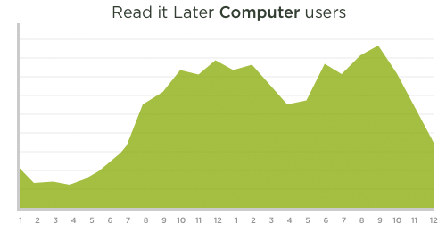
This graph shows the number of articles read each hour by Read It Later users on their computer. The number of reads grows more sharply until noon and then begins to fall off until after work (6PM – 9PM).

Read It Later Computers

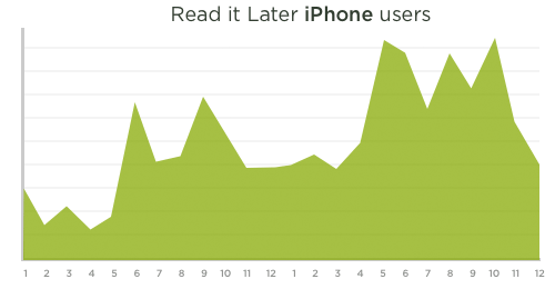
The second graph shows the number of articles read by iPhone users each hour. There's four major peaks: 6am (breakfast); 9am (the morning commute and start of workday); 5pm – 6pm (end of the work day and the commute home); 8pm – 10pm (couch time, prime time, bed time).

Read It Later iPhone

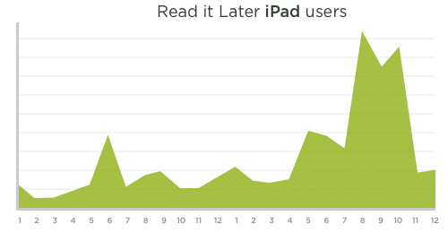
As you can see there's quite a difference between how people read on computers and on mobile devices. The difference is even more significant when you look at when the same articles are read on the iPad.

Read It Later iPad

iPad readers are much more active in the evening from 7-11pm. Once again, the same use case (reading saved articles) results in different behavior with a different device.

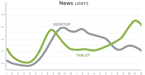
The same distinction between tablets and desktops can be seen in weekday consumption of news content by hour of the day. The use of computers is heaviest during work hours while tablet use once again peaks in the late evening.

News: Tablet vs. Desktop

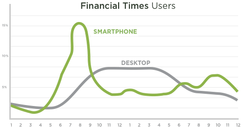
Comparing a news site's traffic between smartphones and desktop devices also shows a big difference. In this case, the Financial time's Web site sees a higher percent of mobile devices in the morning and a dominance of desktop devices during the day.

Financial Times: Smartphone vs. Desktop

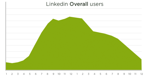
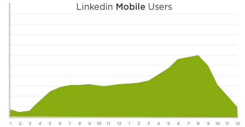
The opposite pattern seems to be true on the social networking site, LinkedIn. LinkedIn's mobile traffic increases towards the end of the day. Likely when people are leaving work disgruntled and searching for a new job!


LinkedIn Overall Use 

LinkedIn Mobile Use

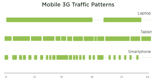
Even without a common service, different devices lead to different behaviors. Looking at how long a random laptop, tablet, or smartphone is connected to a 3G network shows a distinction between the number and length of online sessions.

Different Devices on 3G networks

As these examples illustrate, the type of device clearly influences when people use distinct types of content and services. It's going to be really interesting to see how these behaviors change as networked consumer devices continue to evolve.

9 Laws of Consumer Affinity in the Digital Age


Go to article


Brian Solis is principal of Altimeter Group, a leading research-based advisory firm. Brian is also the author of The End of Business as Usual, which explains how to tap into today’s biggest digital trends. Follow him @briansolis.

Today, people have uninhibited access to platforms, channels and tools to express themselves at will. That group’s voice, employed individually or collectively, can reach the masses to organize game-changing movements across the world. Yet, despite the universal potential for connectivity, businesses are still struggling to understand the real impact of connected consumerism.

On a basic level, consumers need to feel that they are being heard, that action is taken on their behalf. Gaining followers on Twitter or Likes on Facebook is one thing, but to connect and foster real relationships, organizations must learn how to listen and adapt to consumer engagement.
The reality is that society and technology evolve faster than a brand’s ability to adapt. The good news is you have a role in defining where things go next. It all begins with attracting the attention of connected consumers and delivering consistent value to ultimately earn their affinity.

Today’s biggest trends — the mobile web, social media, gamification, real-time — are changing the landscape for business, government, media and consumerism. However, as consumers become better at personalizing their online experiences, they re-evaluate the people, organizations and information with whom they choose to connect. Therefore, the keys to long-term engagement and relationships are intelligence, empathy and resilience.

Although this is the end of business as usual, it’s also the beginning of a new era of visibility. Businesses now have the opportunity to become relevant in new channels and networks by forming meaningful alliances. To do that takes far more than gimmicks, contests and clever videos. It takes consistent value that the user can appreciate over time.

Connected consumers discover and communicate differently than their traditional consumer counterparts. To connect with them, companies must identify potential challenges, trends, POVs and interests. To adapt, organizations need to examine the impact of technology on consumer behavior, and to understand its effect on consumer decision-making and peer influence.

To attract consumers and earn their loyalty, businesses must follow the “Laws of Attraction and Affinity.”
1. Identify where connected consumer attention is focused.
2. Define a higher purpose — genuine intentions that will attract connected consumers and give them something to align with.
3. Establish an identity and a presence worthy of affiliation. Give people something to believe in — something exciting to be a part of.
4. Design your engagement strategies to be beneficial and shareable — this is, after all, about shared experiences.
5. Localize the value, content, storefront and engagement program to match the culture and activity within each direct-to-consumer (D2C) community.
6. This isn’t a power play; stay consistent and dedicated through meaningful interaction.
7. Remain true to the original mission and intention. Do not be swayed by short-term temptations.
8. Recognize and reward community participants — reciprocity is a strong pillar of community relationships.
9. The adaptive business will listen, learn and change based on the needs of the connected consumer. That way, a brand will consistently stay relevant and valuable.

Monday, November 21, 2011

How to Use QR Codes in Your Mobile Phone Strategy to Brand and Market Your Product or Service

One perspective on what people are looking for/expect when they scan a QR code.

Go to article

by Chris Brown on Thursday, November 17, 2011


Interested in how Quick Response Codes that are accessed with smartphones are being used?
Consumers who scan the QR Codes are expecting to get something.

As of June 2011, most people (87%) expect a coupon when they scan a code. Many Fortune 500 companies have started to adopt components of a mobile strategy, but haven’t fully launched them yet.

It seems that most QR codes:
  • are used to distribute product info, social media, coupons and real estate info.
  • are accessed by women (64%)
  • using an iPhone (68%) or an android device. Not Blackberry.
Heidi Cohen offers 15 ways marketers are using QR Codes.


One thing about QR codes, you can change the URL that the code points to, so this allows you to swap out different coupons, offers, promotions, etc. without changing your printed piece. Or in the case of the codes on this truck featured on the You Scan Me Blog, the electric company can connect with their customers and update their hints and tips on how to save electicity without having to redo the expensive graphics on the truck. Just update the destination URL.

For more statistics about QR codes, check out the QR Code infographic from Digital Buzz Blog.

Cyber Monday: Record sales expected

Go to article

By Jessica Dickler @CNNMoney November 21, 2011: 2:14 PM ET

NEW YORK (CNNMoney) -- More than half of all workers plan to do some of their holiday shopping while on the clock Cyber Monday, which is expected to bring in record online sales this year.

The majority of workers with Internet access at the office -- some 75.9 million people -- plan to take a break from their day-to-day duties to get some shopping done next Monday, according to Shop.org's eHoliday survey released Monday.

Last year's Cyber Monday was the most popular online shopping day of the year with sales over $1 billion, according to data compiled by online tracking firm ComScore. And this year, even more shoppers are jumping on the bandwagon. Sales for 2011 are projected to hit a record $1.2 billion, Andrew Lipsman, ComScore's industry analyst, said.

The lunch hour, or noon to 1 p.m., will be the busiest time for online shopping that day, Claudia Lombana, a shopping specialist for PayPal. But bosses shouldn't expect much work to get done during other times either, she added.

"Productivity will be lower than usual on Cyber Monday because people will be shopping from their computers all day," she said.

Evidently, the lure of the online deals will be difficult for many employees to resist. Eight-in-10 online retailers will have special promotions on Cyber Monday, according to the survey by Shop.org, an online division of the industry group the National Retail Federation.

"In addition to many free shipping promotions, there will be plenty of extra ways to save on Cyber Monday, including percentages off entire sites and online-only sales," said Shop.org Executive Director Vicki Cantrell in a statement.

Most retailers will offer coupons or across-the-board discounts and more than one-third will have limited-time promotions. Another third will offer free shipping and about 15% will have a free gift with purchase, the Shop.org survey said.

Fluidity Of Content And Design: Learning From Where The Wild Things Are


Go to article

Have you read Where the Wild Things Are? The storybook has fluidity of content and design figured out.

It goes that one night, protagonist Max “wore his wolf suit and made mischief of one kind or another.” He hammers nails into walls, pesters a small dog. Author Maurice Sendak doesn’t explain these hijinks textually for the reader. The mischievous acts are illustrated on the right-hand pages. Readers make the narrative connections for themselves.

Wild Things Book
Photo of the book Where the Wild Things Are

The words and pictures depend on each other for completeness. Web designers can employ the same complementary dependence of graphic and text in their own work. It encourages a sense of belonging and can create strong first impressions, which are often essential to effective Web design. Because Web design is not confined to page-by-page display as storybooks are, we’ve got no excuse for neglecting Curt Cloninger’s assertions that a design “has to somehow be relevant to the content, accurately representing its purposes in the medium,” and that “the content has to be useful to the site’s audience.”

This post explains four strategies for improving fluidity of content and design, and we’ll gauge the effectiveness with which several websites use these strategies, taking special note of what we can learn from Sendak’s Where the Wild Things Are.

[Editor's note: A must-have for professional Web designers and developers: The Printed Smashing Books Bundle is full of practical insight for your daily work. Get the bundle right away!]

With Graphics As Your Witness

When editing critical papers during my undergrad, I was constantly mindful of backing up every claim I made in writing. Describing a protagonist as “yearning for a return to childhood” wasn’t enough to convince a professor unless I could refer to a passage where this was suggested.
Though published way back in 1997, Jakob Nielsen’s analysis in “How Users Read the Web” still offers a storehouse of relevant advice about how users gauge legitimacy online. He suggests that when businesses use promotional language online, they create “cognitive burdens” on their users, slowing down their experience with the website, triggering a filter by which they weigh fact against fiction.

Instead, use design to complement or convey self-promotion, easing user skepticism from the get-go.
Makr Carry Goods effectively “backs up” its content with graphics to convince users of the “news”-worthiness of its work. In the example below, the visual promotion of the products complements the text: without having to scroll over the images, we see the products themselves as being the news.

Makr Home

Scrolling over the images on top reveals the textual “news”:

Makr Hover

From there, users can carry on their visual journey through the Mark Carry catalogue, enticed to read on by the persistent connection between the product and the news section, a connection that compels users to explore further.

Key to this graphic-textual connection is the visual quality of the products themselves. Without the clean white presentation and professional style, the visuals here might fail to suggest a connection with the news. But the products have been presented to impress.

Without engaging visual confirmation, content will often fail to persuade.
Take Mark Hobbs’ professional website:

Mark Hobbs

He claims that he’s “not normal.” He’s “extraordinary… adaptable, loyal, ambitious and an Eagle Scout,” and he’s “like a sponge” (among other things). If he were getting points for descriptiveness, Hobbs would take first place. But he’s got no visual evidence of any of these claims. No hint at this lack of normalcy.

Besides, as Nielsen’s studies suggest, users generally dislike “marketese”: writing that is boastful, self-promotional and full of subjective claims. Then again, should claiming not to be normal be considered a boast?

Mark’s claims could have been justified by an impressive and immediate visual display of his past work. Engaging users with the strict facts of his expertise could have reinforced his textual claims.
Consider the home page of Rally Interactive:

Rally

It is “here to help you build digital things.” We know this because of the two immediate examples of its work, presented in triangles that recall other projects that required exceptional skill: the pyramids.
Rally’s folio effectively demonstrates a strategy of fluid content and design. The firm backs up its claim and provides users with an immediately useful and positive association. The visual and verbal prompts coalesce to convince users of Rally’s expertise.

Going back to Where the Wild Things Are, if Sendak hadn’t included visuals of Max’s misdoings, what sympathy could we gain for him as his mother sends him up to bed? We can interpret his “mischief” any way we choose, but Sendak’s visual direction helps us gauge what kind of protagonist (or antagonist) Max will be for the remainder of the story. Verbal prompts simply wouldn’t cut it.
Fluid content and design reduce the user’s search time and, in this case, justify the claims made textually. Users don’t have the time or willingness to hunker down and read, particularly when looking for a service. Fluid content and design convince users of the truth of a claim before they even begin to question it.

Tighten Up

Once you’ve eliminated any refutable claims, you might find your content looking a bit sparse. In fact, you want it naked: easy to scan and to the point.

Christine Anameier’s article “Improving Your Content’s Signal-to-Noise Ratio” points us in the right direction for creating tight content that isn’t afraid to depend on suggestive design to share the workload.  There will always be information that the user cannot process visually. So, what should you put in text?

Anameier suggests segmentation, prioritization and clear labeling to make the most of your content.

Segmentation

Segmentation entails sectioning content on the page according to audience or task.

The home page for Jessica Hische’s design portfolio does this effectively:

Jessica Hische

The home page targets the specific needs of users. Hische has divided the links to her services according to what particular users will be looking for, sparing us long descriptions of each service.
Hische also spares us a textual description of the quality of her service, instead pairing tight layout of text with sprawling, confident design. We can gather from the background a sense that she has clean organization. The orange ribbon font “welcomes” us and puts us at ease so that the text doesn’t have to.

Prioritization

Prioritization, as Anameier says, requires that you “understand your audiences and their tasks, and decide what your website is trying to do.” Structure your website to reflect these tasks, removing any content that strays from the path. Hische’s home page demonstrates a comprehension of her users’ purpose for visiting the website, and it wastes no words.

Content and design fluidity entails deciding what should be explained textually and what should be demonstrated graphically. Hische does not verbally boast about her quality of service. The design does that for her, conveying an array of positive attributes, from classic taste to proficient organization.

Hische recognizes that the first priority of users is not whether she’s any good, but whether she offers what they need. Once that is clarified, users will look into the quality. Keyword: look.
Creating those fluid user experiences in which content and design cohere requires, as Mark Boulton states in “A Richer Canvas,” “text that feels connected to the physical form in a binding manner that should make it invisible.” Anameier herself says that incorporating “specific and accurate link text, page titles and headings” gives users the luxury of perusing graphic elements on the page without being disrupted by navigation obstacles.

Labeling

Labeling that is structured with the user’s goals in mind will be trim and to the point, “invisible,” as Boulton suggests, so that the visual showcase enjoys some attention, too.

Tight content that follows Anameier’s guidelines will visually suggest your service’s qualities and attributes strongly. The description of the service itself will rely heavily on text, but what sets your service apart from others can be conveyed visually. Creating cohesive visual and textual discovery paths for users replicates that same sense of control that users get from the storybook.

Doodle Pad superbly utilizes segmentation, prioritization and clear labeling on its “About” page:

Doodle Pad

Carrying over the sketch-book theme to its visuals, Doodle Pad sets down user goals with clarity, displaying information directed at clients and creative professionals.

The labelling is clear and styled with familiar doodling motifs that show the user where to look for what they need. Key questions are answered, and the word count is not too shabby for a software concept.

Impressively, Doodle Pad connects the imagery and layout to the overall concept without over-informing or weighing down users with elaborate language. It gives us notebook-style notes for a notebook concept: tight and user-friendly.

Check The Narrative Voice

Curt Cloninger’s article “A Case for Web Storytelling” argues for narrative voice as being an essential consideration for Web designers who want to create engaging user experiences.

Designers are at a great advantage when it comes to synthesizing text with graphics. We can create a rich narrative tone that convinces and directs users. We are able to explore and experiment with the Web’s possibilities, going beyond Where the Wild Things Are and celebrating non-linear narratives, incorporating several kinds of interactive media.

With Web design, narrative voice need not stay put in the text. It’s more flexible that in storybooks, and Cloninger encourages us to play with that.

For instance, look at the layout for MailChimp 5.2. Toying with slogans that would look out of date on another Web page, the designers evoke nostalgia with their use of background images, color and typography, elements ripe with narrative potential:

Mail Chimp Retro

Viewers interpret the slogans the right way because of the text’s ironic connection to the design. The “real people behind all those email addresses,” is a wink from the designers, because the viewers recognize that the “real people” in the background don’t look very “real” at all.

Users will commit to a fluid narrative online if the design fully commits to the content. And as Cloninger says, using narrative voice through Web design presents countless possibilities for exploration.

MailChimp explores one such possibility with its demo video, complete with more “wholesome” design and content:

Mail Chimp Retro 2

Users can expect to be led on this retro journey through the other formats for narrative voice, as the video suggests with its old-school film-reel introduction.

The narrative voice is so woven into the content and design that MailChimp 5.2 could offer all kinds of 1950s-terrific claims and users would be moved to follow along.

MailChimp 5.2 experiments with tailoring content and design to a narrative voice, but it is effective because of its consistency. If it hadn’t committed to a particular narrative style, then the escapist spell of this user experience would have been broken.

Green Tea Design

Green Tea Design has chosen a watery, traditional Japanese-inspired design for its website. A geisha shades herself with an umbrella, looking down meekly, making for a quiet non-confrontational effect. But look at the aggressive text: “We don’t design wimpy websites that get sand kicked in their face by the competition.” The text goes on the offence, but the design doesn’t align with or enhance the narrative voice.

Try this: choose one adjective with which you’d like users to describe your website. Affix a sticky note of this adjective to the top of your monitor, and measure every sentence on your website against this adjective. Ask yourself whether the content aligns with the adjective. Now pour over your design and assess it by the same measure. We’re looking for matching sensibilities. Does your content and design align with how you want users to feel about the website?

In Where the Wild Things Are, the narrative tone is the anchor in Max’s hectic journey. Consistent, calm and matter of fact, even when Max is off dancing with the wild things, the voice elicits the reader’s trust as it sees the protagonist back to safety.

Readers settle into this consistency the way Max settles into his boat for “in and out of weeks / and almost over a year / to where the wild things are,” and again “back over a year / and in and out of weeks / and through a day.” It steadies the commotion in Max’s imagination.

Here, readers recognize the tension between the consistent content and the disruptive visuals as the mark of a superbly imaginative journey, where anything can happen, but where eventually everyone must return home.

The narrative commits to this tension until the end, when Max gets back to his room, where dinner is waiting for him, “and it was still hot.”

As a children’s storybook, Where the Wild Things Are doesn’t employ multiple forms of narrative expression. But it is an effective example of the co-dependence of playful and experimental text and visuals, in which the narrative voice incites chaos and calms the senses at the same time.
One last example of a committed narrative voice:

Forefathers

Recalling Gold Rush-era drama and Victorian carnival sights with its effective design elements, Forefathers maintains an adventurous tone, employing text that is consistent, descriptively appropriate and authentic.

Be Mindful Of The User Experience

As Elizabeth McGuane and Randall Snare state in “Making Up Stories: Perception, Language and the Web,” as Web users scan pages, they are “filling in the gaps-making inferences, whether they’re based on past experience… or elaborate associations drawn from our imaginations.”

Trust the user to connect the graphics and text, and expect them to want to. Cloninger says that “the more power a user has to control the narrative himself, the more a visitor will ‘own’ that narrative.”
Keep the descriptions visual. The acts of “mischief” in Where the Wild Things Are are graphic. The connection is made when both elements are harmonized into one idea. The user will be willing to read the text and view the corresponding image if both elements are compelling.

Looking at Jonathan Patterson’s effective online portfolio, we can see he has maintained a fluidity of content and design by basing the user’s experience on the motif of “fresh meat”:

Jonathan Patterson

Patterson’s “About” page looks like a steakhouse menu. The text on the first page hints at a description of a meal, while suggesting the page’s function. The website can be flipped through like a menu, giving the user choice and control. The text is simple and linear, mirroring the sequence of appetizer, main course and dessert in a restaurant menu. Fluid text and design help Patterson to create a particular experience with his portfolio.

Maurice Sendak employs similar tactics in Where the Wild Things Are, encouraging readers to expand their gaze to match Max’s ever-growing visual landscape. As Max moves out of his room and onto the sea, the content on the right-hand pages (otherwise bordered in thick white space) creeps over gradually, thrusting more colors onto the facing page. At one point, a sea monster appears on the left-hand page, which was otherwise reserved for text and white space.

Here is the user experience at its most polished. The change comes quietly, invisibly, but the reader is aware that something is different. The protagonist’s growth has been connected with the reader’s experience of the narrative through the placement and cohesion of text and image.
Another polished example of fluidity in content and design can be found in an actual restaurant’s website layout:

Denny's Home

Yes, Denny’s. Look familiar? Replicating the experience of perusing a Denny’s menu, this layout shows how, in Patrick Lynch’s words, “visual design and user research can work together to create better user experiences on the Web: experiences that balance the practicalities of navigation with aesthetic interfaces that delight the eye and the brain.”

Denny's Menu

The user controls the narrative here, with fluid navigation options that maintain the menu-like aspect of the layout, and a pleasing visual presentation that, as Lynch says, “enhances usability.” Filling in the gaps between glancing over a Denny’s menu and browsing the website, users feel encouraged to control their experience.

Conclusion

Fluidity of content and design requires that you trust users to make connections. By making the tone consistent, backing up your claims, tightening the text and being sensitive to the user’s experience, you can be assured that users will draw the conclusions you want them to draw. Designers of promotional Web projects can learn these lessons in part from storybooks such as Where the Wild Things Are, which demonstrates the essential elements of user control and delight. Trust your inner child; it won’t steer you wrong.
(al)