TO REACH YOUR AUDIENCE, LESS CONTENT IS MORE CONTENT
An Interview with Martha Dennis at UGA's Terry College of Business
KEVIN HOWARTH
JUN 27 2013
 In the hyper-competitive world of MBA programs, content matters. Prospective students range from those just a couple of years into their career to high-powered executives looking to deepen their leadership abilities. With such different audiences seeking MBA programs in an information-saturated age, the Terry College of Business at University of Georgia realized it needed to more effectively compete and cut through the noise.
With the help of Content Science, Martha Dennis, Director of the Office of Marketing and Communications at the Terry (right), decided to take a fresh look at understanding how the college’s MBA content worked. In this interview, she shares some of her lessons learned along the way—how less is more, how visuals and infographics complement textual content, and how—at the end of the day—audiences matter the most.
What led UGA’s Terry College of Business to reexamine its MBA website content? What content issues or challenges were you noticing?
During my time at Terry, I’ve seen a couple of website redesigns. We based our previous redesign on our institutional organization structure. That framework works well for internal people trying to find information but not necessarily for people from outside the college accessing our website. Not only was the information organized without much thought for our primary target audience—prospective students—but too much content bogged down the website. As an example, people internally used it as an advising site and posted information there that applied to current students. Instead, we needed to focus on prospective students.
Since most of the content in our previous redesign was really just restructured and rearranged, we didn’t really get rid of anything or change much of the content. When we started this current redesign, a key goal was to create an entirely new structure to make it more of a marketing site rather than just an informational site.
What kind of feedback were you getting from users?
On the main Terry College of Business site (which focuses on undergraduates), people weren’t aware of our programs. A person would have to know that the program existed before coming to the site in order to find it in the navigation. Undergraduates could not quickly see all of the options available to them, especially options that they didn’t know about before coming to the site.
On a good note, everybody really liked the old site. People could find things they needed but the website did not help them discover things they didn’t know about. We saw that interest in certain programs started to go down. Even within the MBA program, our students didn’t realize the areas of concentration they could select. That useful information lay buried in a large volume of content.
The Terry College of Business has three MBA programs with many similarities but also some key distinctions. How did you approach reworking this content to make sure it connected with the right audiences?
With Content Science’s help, we realized that people wanted to see differentiation between our three MBA programs. We provided a Compare Our Programs section that helped people self-identify. Our previous website did not have that type of clarification. For example, if someone is an executive, works full-time, but does not have the ability to take weekends off, that person would be a good candidate for the Professional MBA Program. Putting this information into a quick reference helps people find and recognize themselves within a program, and this comparison exercise gives us a better chance of winning a prospective student over.
We identified and brought to the front some of the things that made us unique that were previously buried in the content. For example, while the core sequence is important, we instead brought information about the concentrations more to the front. We identified what people will learn here and how these concentrations will help their career grow. We chose to emphasize what this program will do for you as opposed to relating general information about the Terry College of Business.
We now focus on what we have, what we’re going to do for you, and how your life will change when you come into this program. It’s a very fresh approach, and one that’s made a big difference. We worked with Content Science to help figure out how best to bring this important information forward while pushing less important details deeper into the site.
Why did visual content become more important to you in the redesign?
If you don’t put your best face forward in such an extremely competitive market, then you’re going to miss out on opportunities to recruit students. Just like we better centered the content on what the program will do for students, we wanted students to visually see the MBA experience for themselves through better visuals such as photos, videos, and infographics. Previously, we had video interviews on our site but they were just traditional talking heads. Now, the people on the videos speak more eye-to-eye to students. Visual content helps people see content at a glance, especially if they are just scanning the page, and high quality photos and videos enhance the appearance of an MBA program.
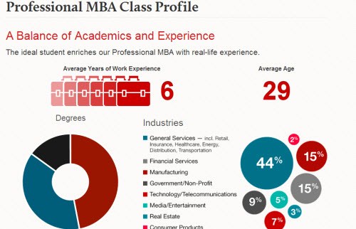
(Here, we see a sample of a Terry College of Business infographic. This one highlights class profile data for the Professional MBA program.)
How did reimagining this specific MBA content impact other areas of the Terry College of Business?
We started bite-sized with the MBA program, which we used as a model to build out the rest of the college’s redesign. The wider challenge is making the entire website appear simpler, cleaner, and easier to find information for all audiences.
For example, while it doesn’t constitute a high volume of traffic, we need to sell ourselves to potential faculty. That means not only showcasing current faculty research but also highlighting information about our programs that appeal to potential faculty members. This content needs to appear educational, heady, and philosophical, highlighting the depth of research going on at Terry.
No matter what the audience—prospective students, faculty members, donors, etc.—this website is going to be a large part of what they see. Content needs to work hard and help market, inform, and sell people on our school. That’s why the content strategy behind this redesign serves such a critical role.
As Dennis points out, your content strategy (or lack thereof) will impact how you communicate with your audience. Enterprises face similar challenges, especially when customers split into distinct groups that each need unique content. Just like UGA’s Terry College of Business, make sure you correctly identify your audiences, analyze what content they find most important, and (re)build your website experience to accommodate those particular content needs.
Explore the redesigned Terry College of Business MBA program site for yourself.
No comments:
Post a Comment
Note: Only a member of this blog may post a comment.