Go to article
Good design is an interesting thing. It's easy to identify but hard to explain. If you have ever tried to mimic good design, you'll really know what I mean. Sometimes, even with the "inspiration" right before your eyes, you struggle with creating something that feels as "tight" as the original piece.
My goal is to give you a crash course in some of the fundamental elements of design as well as a few subjective best-practices from my experience. Design is too much of an interrelated mash of intuition and science for me to begin to try and enumerate explicit rules, but what I can do is share some direction and things to watch out for that will hopefully make you a better designer.
Introduction

Visual design is the sum of many details. Good design is forgiving to a degree. Get one or two of the details wrong, and the whole piece might look acceptable to enough people. But there reaches a point of divergence where everything falls apart.
Perfection comes from relentless iteration. Don't think for a second that even the world's best designers can visualize final products right off the bat. Experience will refine a designer's perception of good work and help improve her handle on creative tools, but there is no escaping elbow grease. Ever.
White space
I'm starting with white space, because it is perhaps the single most important overlooked factor to consider in visual design. White space directs the eye and provides balance to content on a page. Look at this article. Most of the right side is empty. This wasn't an accident or a result of an absence of content - it is there, in part, to help focus attention on the content of this article.
White space need not be white. It can be another color, a pattern, or even a full-blown photo. Another, better word, to use is negative space. A helpful design exercise is to visualize the white space of a page as standing out from the rest of the page. What does it look like? When white space feels "whole", like it's "hugging" the content, without being overbearing, you're probably using it well. If it feels like disconnected patchwork, you're doing it wrong.

Here we have the letter "e". I have turned it on its side and covered half of it to obscure our tendency to see it as a letter of the alphabet. I have also reversed the colors between the background and the foreground. See how the negative space "holds" the letter. You can almost see the negative space as its own entity.
Fonts and readability
"Web design is 95% typography" says design agency Information Architects. Problem is, there is no real agreed-upon convention for font use. Designers argue about fonts all the time about things like what constitutes a good font, when and where should you use a certain font, and is Helvetica the greatest thing invented since sliced bread?
Best I can do is give you some thoughts:
- While some claim that serif fonts tend to be more readable, there has been no conclusive study proving that, making it appear to be convention over best practice.
- Don't make text blocks too wide. One of the hardest things for the eye to do when reading body content is to find the next line of text. The further the end of one line is from the beginning of a new line, the more difficult it is to anticipate the position of the new line. Consider why newspapers are written in columns rather than across the entire page. Or why the text block on this site is only 600 pixels wide.
- Save expressive and unconventional fonts for headers, or better yet, signange/branding/identity work. Readability is objective #1 for content.
- Give body content enough line spacing and padding to standout. Simple rule of thumb: text looks good with 1.5x line height (so if you choose a font size of 18 pixels, 27px is a good line height).
- If you're a web designer using Photoshop, keep in mind that browsers and operating systems render fonts differently. As a general rule, , OSX/Linux machines render fonts with more weight and antialiasing than windows based machines. Apple does a better job at softening edges, but it comes at the expense of crispness. As a result, light fonts tend to look better on Apple machines. Photoshop will render greater "weight" regardless of OS.
Kerning & Character Spacing

Here is an awesome game that will help train you to think about kerning.
Though related to fonts, kerning and character spacing, are special enough that they deserve their own header.
First some definitions. Kerning refers to the the optimal default spacing between individual characters, while character spacing is a standard additional (or reduced spacing spacing) between all characters in a body of text. Like white space, because it's something you don't immediately "see", kerning and character spacing can easily be overlooked.
In the time of typewriters, fonts (like courier sans) were monospaced, meaning the space between characters was static. Nowadays, they're not, and kerning matters. Most professional fonts have built in kerning pairs, which is exactly what it sounds like. Someone went through every combination pair of characters and decided on an optimum visually appealing space between them. When kerning pairs don't exist, most software will generate its own best guess. If you are a Photoshop user, note that you can often choose between "metric" and "optical" kerning. Metric kerning uses human-generated kerning pairs, while optical is algorithmic. It's debatable which looks better, but the argument favoring metric is clearly that someone took the time to find optimal kerning pairs.
Character spacing, along with color palette for instance, can do a lot to express the emotion of a design. Tight character spacing can connote modernity or absolutism, while wide character spacing can connote something lofty or whimsical. A couple things I've noticed.
- Wide character spacing tends to look better with all caps text
- Stick to standard spacing with body content
Perspective
Our visual perception in the real world is dictated by rules and shortcuts developed by our brain to discern objects and patterns from the raw neural input of our eyes. Much of visual design is about understanding and exploiting these shortcuts to imply meaning. Here are a few examples you can use in your design.
- When it comes to size, extremes matter. Put two objects next to each other of about the same size, and it's hard to infer size. Make one much larger than the other, and all of a sudden you "see" size as an influencing factor in design.

By placing two objects of very different sizes next to one another, you help users infer their sizes through relativity.
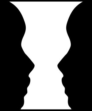
- Closure is a psychological predisposition we have to perceive implicit patterns to complete incomplete forms. By exploiting this tendency you can ironically reinforce the perception of a figure by actually leaving parts out.

An example of closure
Dimensionality and Figure-Ground Relationship
Drawing the eye's attention to a figure can be aided by the fact that our brains want to see a background and a foreground. If you give the user additional cues, through methods like skewing, scaling, or blur, you can mimic depth of field in your designs and enhance that relationship. Elements "closer" to the screen will typically imply greater importance.

The actual giraffe stands out in the image on the left, whereas the word "Giraffe" stands out in the image on the right.
Beware of unorganized design that blurs the line between figure and ground.
Information Hierarchy
The eye should have to do as little work as possible to decipher information hierarchy on a well designed page. What is the title? Where is the content? What content does this title refer to? These are the types of things our brains should subconsciously determine. If you find you have to put in mental effort to understand what is what on a page, you have some serious information hierarchy problems.
There are four obvious tools to help you organize information: indentation (or padding), color, and size. Play around with these to see what feels right. The one, slightly less obvious, tool is spacing. When two elements are placed side by side with one another, even if their size and color differ, the eye will often assume equal significance or parallelism between the two. Notice how the title of articles on throwww spans the entire page while content does not. The "Articles by" pane floats on the right side of the page, but below the title, not inline.
Color
The use of color is maybe the hardest thing to "teach" to someone else. Like some other design considerations, a refined experience of color comes from practice, experimentation, and keen observation.

Compare the "feeling" you get looking at these two screenshots. The example on the left makes heavy use of pastels, off-whites, and gradients, while the one on the right uses highly contrasting elements.
There are encyclopedia-length books about the history and use of color. Needless to say there's too much to possibly say about the matter in one post. Instead, let me get as practical as possible.
- Think of colors in context of palettes. The human perception of a figure's color is completely relative to the colors of a figure's surrounding. This is why palettes are incredibly important. The same shade of red or blue will look quite different and conote a different "feeling" against two different background.
- Experiment with using off-whites and off-blacks instead of pure white (#ffffff) or pure black (#000000). Pure white and pure black stand out a lot and can dominate a page, so use them sparingly and with purpose.
- Do not use too many vivid (high saturation) colors in a single palette. Color palettes, like other elements of design, is aided by hierarchy and focus.
Here's a test. What color is this text? You'd be wrong if you said black. You'd also be wrong if you said grey. It's a really dark blue. Why not just use black or grey? Because black would make the body content stand out a tad too much, and grey looks kind of flat against an all-white background. That's not a rule. It just looked and felt right on this project.
Personal Style
Here is some counter-intuitive advice for you: don't try to develop a personal style. I admonish personal style because subjective preferences and habits interfere with user-centered design. The choice of style should be entirely based on user needs and the purpose of what it is you're designing.
Thing is, no matter how hard you try, you will develop your own style. It's inevitable. So why focus on it? Create things entirely based on their purpose and everything else will fall in place.
Concluding thought
The most important objective of information design is to make work navigable and readable. The complementary use of color, white space, perspective, and font curation are your friends. Consider each in relation to one another. Refine the hell out of your work, and beautiful things will happen.
If you read this far and liked it, you can follow me on twitter
Additional Reading
Someone asked for references to expand on some of the things I introduced in this article. So here are some resources I've found helpful The Elements of Graphic Design - The best general graphic design book I've ever read. Thinking with Type - A really useful book about Fonts. Kerntype - An interactive tool/game to get a feel for kerning. Information Architect's Blog - A blog by a leading design agency. * My portfolio - Shameless promotion of my own work.
No comments:
Post a Comment
Note: Only a member of this blog may post a comment.