Showing posts with label infographics. Show all posts

Thursday, May 15, 2014

10 Tools to Create Social Media Graphics

via Practical Ecommerce http://ift.tt/1iLCJrB


With millions of images uploaded each day, social media is now a visual medium. Platforms such as Instagram, Snapchat, Flickr, and Vine make sharing photos and videos much easier than in the past.
Because they convey emotion and add a human touch, images enable businesses to create a closer connection to their fans and followers, which can result in a higher conversion rate.
Here are 10 tools to help you enter the visual social web quickly and easily.

1. PicMonkey

PicMonkey
PicMonkey was the company that created Picnik, acquired by Google in 2010.
PicMonkey, the company that made Picnik, a photo-editing tool that was acquired by Google in 2010, offers its own photo editor that works in your browser. There is nothing to download or install. Apps are available for use with Facebook and Google Chrome, as well.
With PicMonkey, you can edit photos, make photo collages, and add filters and text. The free option comes with a wide variety of photo frames, special effects, and font types. You cancrop and resize photos, and add text to images. You can select photos from your computer, Dropbox, Facebook, and Flickr.
PicMonkey is free to use. Premium plans (available from $33 per year) offer more tools and editing options.

2. Canva

Canva
Currently available by invitation only, Canva is an editing and design platform built with social media in mind.
Canva was developed for those of us who have difficulty using more sophisticated photo editing and design tools such as Photoshop. It offers many design options expressly for use with social media.
You can create images for use on Pinterest boards, Facebook covers and ads, Twitter headers, blog graphics, and a variety of other images. Canva offers preconfigured image sizes, or you can select custom dimension options.
Canva is free to use, but currently only available via invitation. The site also offers stock photo images, which are available for purchase at a nominal fee.

3. Pixlr

Pixlr
Pixlr offers three options: Editor, Express, and Pixlr-O-Matic.
Photo editor Pixlr is built for non-professionals and professionals who need Photoshop-style editing tools. It comes in three versions: Pixlr Editor, Pixlr Express, and Pixlr-O-Matic.
  • Pixlr Editor. This is a full-featured photo editing and design platform, not unlike Photoshop.
  • Pixlr Express. Similar, to PicMonkey, the express version offers a number of preconfigured editing options, filters, photo frames, and text overlays.
  • Pixlr-O-Matic. Even easier to use than the express version, Pixlr-O-Matic lets you add effects, overlays, and borders to photos.
Pixlr is built in Flash; you will need to have the Flash plugin to use it.

4. PicCollage

PicCollage
PicCollage is an easy-to-use tool for making photo collages.
PicCollage is an app for iPhone, iPad, and Android devices that allows you to use photos from your Facebook account or camera to create collages.
Users can select a background, add photos and text, as well as crop, resize and edit photos.

5. Quozio

Quozio
Quozio turns quotes into images.
Quozio is a simple-to-use tool that allows users to type a quote, select a background, and share to your social network.

6. Social Image Resizer

Social Media Resizer
Social Media Resizer crops and resizes images for use on social networks.
Social Image Resizer is a simple utility designed to resize photos for use as Facebook covers, Twitter header images, Google+ cover photos, profile images, and more.
You can save photos in JPEG, PNG, and GIF formats, and create favicons from any photo, as well.

7. Photovisi

Photovisi
Photovisi is another tool for making photo collages.
Photovisi is a free, easy-to-use photo collage maker. You simply choose a design template (many are available), add photos, and either save the finished product to your computer or share it on social networks.

8. Piktochart

Piktochart
Piktochart makes creating infographics easier to do.
Built for the non-designer, Piktochart is web-based tool for creating infographics and visualizations. Free and paid versions are available that offer design templates on which you drag and drop different shapes and images. You can also add line, bar, and pie charts using data from CSV files, and then export images to PNG and JPG formats in either print or web quality.

9. Easel.ly

Easelly
Easel.ly uses a drag-and-drop interface to create infographics and visualizations.
Easel.ly features free infographic templates and design objects that you can use create and share visual ideas online. Similar to Piktochart, you create infographics and visuals by dragging and dropping design elements onto templates. You can also upload your own background image and start from scratch.

10. Paint.net

Paintnet
Paint.net is a free, downloadable image editor that offers features similar to Photoshop.
If you would like to use some of Photoshop’s features, but either can’t afford Photoshop or don’t care to go to the trouble of learning it, give Paint.net a try.
It is a free download for PCs and offers many of the same features available in Photoshop. It supports layers, has unlimited undo capability, and offers special photo effects, including red-eye removal. You can also draw shapes, add text, and recolor images.

Wednesday, October 23, 2013

The Importance of Visualisation – Mapping the Way Forward


Richard Ingram presenting at the Content Strategy Forum 2013
This is the tidied-up transcript of a talk I gave a month ago at the Content Strategy Forum 2013 in Helsinki, Finland. It was the third consecutive year I’d spoken at the forum and it was quite possibly the most enjoyable talk I’ve given to date.
Note: Though I’ve included screenshots of the most important slides, you might prefer to read along with the full deck.

The importance of visualisation – mapping the way forward

As our species’ love affair with maps is about as old as civilisation itself, I’d like to begin today’s talk by briefly going back all the way to the beginning of human existence. Long before humans could write we have been making and using maps to make sense of the world around us (Figure 1). Each example offers a snapshot into a different time and culture, as well as a unique insight into the political, cultural, and spiritual forces that drive society.
Babylonian map of the world.
Figure 1 – Babylonian map of the world. Clay tablet, probably from Sippar, southern Iraq (c.700-500 BC) © Trustees of the British Museum
Every blank surface you can possibly think of – be it of rock, clay, wood, parchment, paper, or tapestry – has been used to plot places and objects according to their relative spacial positions. And it’s this synthesis of science, art, and history that combines to create these beautiful objects. Every map has its own story to tell and harbours secrets it may never fully reveal. A map can delight, surprise, and unsettle in equal measure. And maps can reveal deep truths – not just about where we’ve come from, but about who we are.
Throughout history the map has demonstrated its versatility. They’ve had an administrative use in marking out national boundaries or individual plots of land, a social use in showing who lives where, a military use in depicting the layout of enemy positions, and a political or propaganda use in showing one country or faction over others. But beyond their two-dimensional depictions of a physical world, maps also afford us the freedom to express the cosmos; to make all kinds of ideas about the spatial relationships of multiple components unexpectedly clear. To draw one is an effective way to establish order on an otherwise chaotic environment. To make it navigable. To make it rational.
City maps are a fine example of creating this impression of order. The whole objective behind creating such a map would be to somehow capture, contextualise, and impose order on an environment which is always moving, growing, and changing. An environment which is falling apart and burgeoning at the same time.
As content professionals, we’re often tasked with making sense of complex, unpredictable, and mostly disorderly environments – home to micro communities with their own agendas, rules, and systems of government. Managing content, processes, and people can be a complex endeavour, and managing them in large systems only increases the complexity.
In his famous map of London published in 1747, John Rocque shows off the perfect enlightenment city (Figure 2). It’s clinical, controlled, and beautiful. This is a map of London at its most picturesque. It’s a map that imposes order on a city of unrelenting change, and it gives all the appearance of objective truth. Rocque has deliberately left out the ugly, unsavoury elements of the city.
John Rocque's 1746 map of London
Figure 2 – John Rocque’s 1746 map of London, which deliberately ignored the city’s unsavoury elements.
To Rocque, it was more important – and lucrative – to present and promote London as the greatest city of its time than it was to present some of its grimier realities. Indeed, mapmakers through the ages have always responded to the mentalities, and met the requirements, of the societies in which they have been created. They quickly learnt that the quality and effectiveness of a map couldn’t simply be judged by its scientific precision, but by its ability to serve its purpose. Without question one of the huge appeals of Rocque’s map was that it successfully imposed order on chaos (Figure 3). This was a visual interpretation of London which offered its inhabitants a sense of promise and a sense of pride as well. To Rocque this map was about imposing clinical precision onto a city which he knew couldn’t literally be accomplished. Why? Because of the human element. And this is the main issue: The thing about cities, like large multi-departmental organisations, is people, and people just make it into a bit of a mad-house.
Roque's London map successfully imposed order on chaos.
Figure 3 – One of the huge appeals of Rocque’s map was that it successfully imposed order on chaos.
If we took it upon ourselves to map a complete and literal visual representation of the way content flows within a mid-to-large organisation, we would, in a sense, be mapping a sprawling city. Such a multiplicity of information would need serious reining in if it were not to cancel itself out in a sorry mess. In the end all drawn city maps, however much they distort the truth, are trying to take on the impossible: They are trying to impose two-dimensional order on the chaos that is urban life.
So we’ve learnt that the quality and effectiveness of a map cannot simply be judged by its scientific precision but by its ability to serve its purpose. Aesthetic and design considerations are every bit as important as the mathematical, and often more so. Indeed, maps of this nature have long served as vital political and negotiating tools. In these cases the intended information inherent to the map has to be conveyed in a way that attracts the eye to certain features. Believe it or not but all this can be achieved with even a simple sketch map. Everything that maps are used to represent: placement, proximity, overlap, distance, and direction can consist of only of a few lines and a few letters, with nothing but the essential features remaining (Figure 4). In short: The simpler the better. Maps like this can be used to quickly and clearly communicate our ideas to others. And if sketched in their presence, you can even use them to tell stories.
An effective map need only consist of a few lines and a few letters.
Figure 4 – Everything that maps are used to represent: placement, proximity, overlap, distance, and direction need only consist of a few lines and a few letters.
Every day we come into contact with various kinds of maps which, on the surface, may look wildly different, but they all share the same basic building blocks (Figure 5). It’s all about picking out the people, places, and things – indeed anything whose relative positions we want to compare – and picturing them in a geographical landscape.
Very different maps, same basic building blocks.
Figure 5 – Different maps, same basic building blocks: Exploded view, Concept map, Star map, and Topological map.
The only real challenge is coming up with a meaningful coordinate system (Figure 6). We’re all well versed in the north-south versus east-west coordinate system, but we can make a map of anything using other pairs of opposites like expensive-cheap versus high-low and fast-slow versus small-large.
Find your coordinate system using pairs of opposites
Figure 6 – Finding your coordinate system. Anything can be mapped using pairs of opposites.
Once we’ve defined our coordinates we can start to plot our landmarks (Figure 7), beginning with the most prominent feature of our landscape. This could be an object, person, or an idea.
When plotting landmarks on your map, start with the most prominent feature.
Figure 7 – Plot your landmarks, starting with the most prominent feature.
And then we can move outward (Figure 8), adding more and features and details, illustrating everything from borders and distances to pathways and sets of shared traits. Let’s make a map!
With your map's most prominent feature in place, move outward.
Figure 8 – Move outward by adding more landmarks to you map.

The unfamiliar environment – finding our way

When it comes to getting a grip of that complex trinity of content, processes and people, governance is an important tool (Figure 9). Put simply, governance determines how key decisions are made and who has the authority to make them. Governance defines who is allowed to create, approve, and publish content, and how these decisions are initiated and communicated.
That complex trinity of content, processes, and people.
Figure 9 – When tackling that complex trinity of content, processes, and people, content governance is an important tool.
One big content governance challenge is maintaining consistency with messaging, communication, editorial and content standards throughout an organisation. This is made particularly difficult when many contributors have other responsibilities and priorities besides content. Governance is primarily a human management issue, but one useful way to help maintain these standards is through content management system (CMS) workflow. This functionality helps manage the sequence of steps from adding or editing to publishing.
Let’s imagine we’ve been hired by a regional English Council to design a new content workflow for their CMS. This council is one of 27 large two-tier non-metropolitan counties used for the purposes of local government in England. Approximately 15,000 staff across seven departments are responsible for providing services to 700,000 local people including education, social care, transport, and culture and leisure. Unsurprisingly, it’s a varied, siloed environment. Some departments take responsibility of hundreds pages on the public website, others only a few. And in the middle of it all is the relatively small Digital Services department trying to keep everyone’s content balanced and consistent.
If you were about to be airdropped into unfamiliar, and possibly hostile, territory, you’d want to be carrying either a map or pairing up with a native guide. So as an outside consultant arriving fresh into this large, diverse, politically-charged environment, your first instinct in making sense of it should be – besides asking for directions to the nearest coffee machine – to draw a map. In order to work out how decisions about content are made around here we need to figure who best to talk to besides Mandy, our main point of contact from the Digital Services department (Figure 10) – particularly those who might be influential to the way things work without even realising it. And to start this process we first need to map out our landscape.
We need to figure out who best to talk to in our varied, siloed environment.
Figure 10 – To discover how content decisions are made and how they could be improved in our varied, siloed environment, we need to figure out who best to talk to.
Since we’ve just arrived in this new environment let’s start by placing ourselves and the rest of the Digital Services department on the map. Next we want to add in the six other council departments (Figure 11): Adults & Communities, Chief Executive’s, Children and Young People, Community Planning, Corporate Resources, and Environment and Transport.
We'll begin mapping our environment by marking out each of the seven departments.
Figure 11 – To begin mapping our environment, we’ll mark out each of the seven departments.
Now we need to introduce a coordinate system (Figure 12). So let’s plot our departments by their relative sizes from small—large, and we’ll also ask Mandy how quickly each department takes, on average, to move through the gears of creating, approving, and publishing content.
Ranking each department by their relative sizes and how long their content takes, on average, to go from creation to publication.
Figure 12 – To devise our coordinate system, we’ll rank each department by their relative sizes and how long their content takes, on average, to go from creation to publication.
Our department’s are plotted, so what can we see? If we’re looking for best performing department we need look no further than Corporate Resources, who, despite their large size, are one of the most efficient at delivering content. On the opposite end of the scale are the Community Planning department, who are small and yet one of the least efficient.
Next we want to understand a little more about the politics of the place. So after surveying various members of the Digital Services department, we can map the pathways between departments that they believe share closer communicative ties (Figure 13).
Mapping the pathways between departments that share closer communicative ties.
Figure 13 – Mapping those pathways helps us get a clearer picture of the politics of the place.
So what jumps out now? Our marked pathways tell us that there are two distinct groups, with one markedly quicker at delivering content than the other (Figure 14).
What can our marked pathways tell us?
Figure 14 – What can our marked pathways tell us?
Perhaps if we wanted to bridge the gap between these two groups the Digital Services team might consider trying to form closer ties with the similarly-sized Community Planning department (Figure 15). If we could improve the efficiency of this relatively small department it might provide a positive knock-on effect. To me, the Community Planning department looks like the ideal place for a pilot project.
Where are the opportunities for improvement?
Figure 15 – Where are the opportunities for improvement?
Now we have our map. It’s by no means scientific or pretty but as I mentioned earlier the quality and effectiveness of a map should primarily be judged by its ability to serve its purpose. Our map may only consist of a few lines and letters but we now have a quick and useful overview of the council’s departmental structure. Not forgetting, of course, that we’ve only just walked through the door.

The unfamiliar environment – mapping out a process

Designing an effective CMS workflow requires meeting the needs of the organisation and each of your content players. In the case of our English regional Council scenario, this is our team of authors spread far and wide across the seven departments. To understand how we can improve the author experience we need to ask each of our content stakeholders to describe their current process for planning, creating, and publishing content.
In our conversation with Mandy, Content Officer in the Digital Services department, she kindly talks us through the typical process for publishing a press release on the council website. I’m not an especially quick note-taker so I always ask permission to record the conversation.
I was always taught never to read your slides, but hey-ho.
“On Monday she received a request from John, Highways Manager at the Environment and Transport department, to publish a press release to inform the community of the start of major road improvement work. She first called Helen, Technical Services Manager at the Environment and Transport department, who emailed through the source material and directed her on the technical details that needed to be included.
She continues…
“After completing the draft in the CMS environment, she marked the press release as ‘ready for review’ and emailed Rachael, a Content Manager and colleague in the Digital Services team, and Helen again for their feedback. After one or two line edits, she was ready to mark the press release as ‘ready for publishing’, so she emailed David, a Digital Media Officer to prepare and publish the press release to the test server.
She continues…
“John, Helen and Rachael were all emailed to help her perform a second review of the content, where they duly approved its publishing to the public website. David then got all the glory as usual by hitting the button marked ‘publish’.”
Now, I don’t know about you but I’m lost. The hardest part of these conversations is keeping track of all the different people, roles, and departments as they’re reeled off. When we hear four, five, six names or more it can be difficult to process them; to find form of the relationships between them. To make sense of this complex drama we can make a map that shows who each character is, how many there are, and how directly and indirectly involved they are in the story.
Let’s begin by listing all the characters we heard just then and their roles before sketching their likeness (Figure 16). Don’t worry too much about accurately portraying their looks. You may not have even met them before, but it’s always a good idea to put a face to a name.
The cast of characters in our story.
Figure 16 – Who are the players in our story?
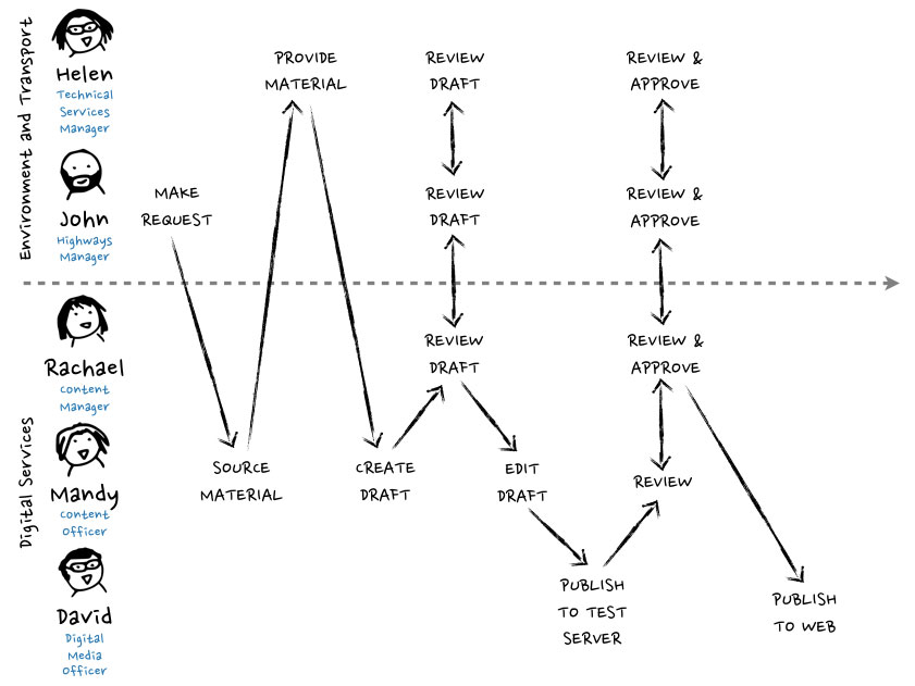
Next we need to separate them by department and plot each interaction and task in chronological order from the initial request to the press release’s publication (Figure 17).
Plotting each character's interactions and tasks.
Figure 17 – Plotting each interaction and task belonging to each character in chronological order (click image to zoom).
This is good. We can clearly see the different roles each character plays and the interactions between them. We can follow this process from the initial request, the research and gathering stage, the creation and subsequent review of the first draft, publishing the draft to the test server, the second round of reviews and approvals, and finally publishing the press release to the web. But we’re still missing features of this story which would further enhance our understanding of this process and how it could be improved. Namely, which interactions and tasks took place in the CMS environment and how long each took to complete.
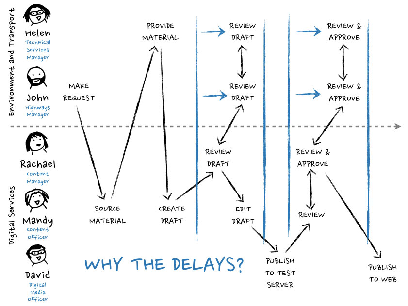
As Mandy almost practically saw the process from start to finish, she’ll be able to help us fill in these details. Let’s first stretch out the timeline to accurately reflect the varying speeds of each interaction (Figure 18).
Stretching out the timeline gives us a more accurate measurement of how long each task took to complete.
Figure 18 – Stretching out the timeline gives us a more accurate measurement of how long each task took to complete (click image to zoom).
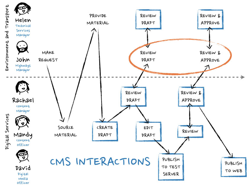
What jumps out now? We can see that John and Helen from the Environment & Transport department took longer than Rachael to review the first draft and to review and approve the test server version. Might that just be because they have other departmental responsibilities besides producing, checking, and updating website content? Possibly. Let’s see what happens when we mark out which interactions and tasks took place within the CMS environment (Figure 19).
Highlighting which interactions and tasks took place within the CMS.
Figure 19 – Highlighting which interactions and tasks took place within the CMS environment might help us reveal where the bottlenecks are in the process (click image to zoom).
Aha! Interesting! John appears to be carrying out his reviews outside of the CMS. How come? To answer this we need to return to our first map.
We can see the Transport and Environment department are on the slower end of the scale in terms of moving through the gears of creating, approving, and publishing content (Figure 20). After interviewing Helen we learn that the department is comprised of three sub-departments: Transportation, Highways, and Environment.
Breaking down the Transport and Environment department.
Figure 20 – Breaking down the Transport and Environment department.
John resides in the Highways sub-department, who we discover has no direct access to the central CMS because of their geographic location elsewhere in the county, and thus is effectively an external contractor (Figure 21). Helen tells us that John has to use email to communicate his requests, edits, and approvals.
The failings of the sub-department might be down to CMS workarounds adding unnecessary time and cost.
Figure 21 – John’s failing sub-department might be down to CMS workarounds adding unnecessary time and cost.
It all makes sense now. The reaction times of the Highways sub-department is adding unnecessary time and cost to this and many other content production processes. It’s compromising the efficiency of the Transport and Environment department and the entire organisation. The intrepid explorer would be wise to investigate whether other departments on the slower end of the scale may be affected when broken down like this. There could be incredible cost-saving potential across the board and opportunities to form closer collaborative ties between departments.
And all this from a couple of fairly simple hand-sketched maps.

The power of drawing – mapping the way forward

Anything to do with aligning content, process, and people is bound to be tough, messy, and complex. But remember that we and others who inhabit these environments are not completely constrained by what has happened before. It is a natural reaction of ours to try to order an environment by fitting it into the categories of our expectations. So when we cannot find a way to fit any new ideas and concepts into these simplified slots, it’s really no wonder we experience those sharp pangs of panic. But we and everyone else around us don’t have to rely on the old established categories, we can always create new ones. Our reserves of intellectual capacity are vast. Perhaps if we’re continually looking upon new ideas and concepts as chaotic and threatening this can only be because we’ve never seriously tried to make use of our potential ability to cope with the unexpected. Believe it or not, we are all amazingly inventive and resourceful, and one of the ways to bring out our innate inventive qualities is to step away from our screens and just draw.
Maps like this can be used to quickly and clearly communicate our findings and ideas to others. And if sketched in their presence, we can even use them to tell stories. It can be an eye-opening experience for everyone involved. We have to fuel our innate curiosity. We have to be willing to look stupid if it eventually leads an insight. Mistakes are just part of the process.
Just remember to keep it simple. You’re not doing it to show off. Often it’s the overly-elaborate pictures that draw too much attention to the art, rather than the idea – and it’s the idea that we want them to remember and to develop.
There really isn’t anything about this level of mapmaking that is beyond us. Make use of shapes, arrows, faces. Find your axis. Make mistakes. Start over and over again until you get it right. There is nothing to be apprehensive about. Just keep it in mind that we’ve communicated using sketched maps from the very beginning. Mapmaking fulfils one of our most ancient and deep-seated desires, which is to understand the world around us and our place in it. It’s very much a basic human instinct.

Recommended reading


via Shut the door on your way out, Cicero… http://www.richardingram.co.uk/2013/10/the-importance-of-visualisation/

Smart, Effective Strategies To Design Marketing Campaigns

Ever since I’ve been involved in the Web, I’ve been fascinated by little things that make a big impact. It’s one of the reasons why I startedcollecting and blogging about these details, which could in some way help others grow an audience. One recurring topic early on was launch and landing pages and the strategies that creators use to expand the reach of their websites, which led to a Smashing Magazine post titled “Elements of a Viral Launch Page.”
Another interesting recurring topic is the campaign page, which you’ll find either embedded in an existing website (Foursquare’s Game of Cones and Dropbox’s Great Space Race) or as a completely independent website (Iubenda’s Orwell Test) that redirects traffic back to the source. Such campaigns have varying goals, such as to drive traffic, to raise awareness or simply to get a single person’s attention.
In this post, you’ll learn what to look out for when creating your own small campaign and how these elements fit together in existing campaigns around the Web.

What Do We Mean By “Campaign”?

The word “campaign” is traditionally defined as a military or political operation that is confined to a particular area or involves a specific type of fighting and that is intended to achieve a particular goal. That’s exactly what we mean here: A campaign is a sustained effort that is slightly beyond your day-to-day business but still connected to it in some way.
Interestingly, a campaign can be carried out with little effort, if you closely monitor what is going on around you and your brand. In the wake of PRISM, we recently ran a small campaign calledOrwell Test, trying to redirect some of the attention to Iubenda, an app that generates privacy policies.
This post contains my observations and a framework for coming up with new campaigns, which you can integrate in your own marketing activities. Thus, it will include subjective opinion to complete the picture.

9 Things To Look Out For

After the Orwell Test campaign, I have been thinking about some of the reasons why it worked and how to come up with even better ways to get the word out about our startup. Obviously, the main driver here was the timing with PRISM and people’s emotional response to its outrageous reach. (Anger spreads faster and wider than joy on social networks, according to a scientific study on Weibo.)
orwell_test_500
The campaign asked a simple question: Is your company any better than the governments that collect data without informing people? This way, we made a connection with what is happening right now. We made a connection to something that people are very upset about (we’ll discuss why that’s important in the section “A Little Viral Theory” near the end), and we challenged them to think about their own behavior.
So, what things can you take advantage of, and what are some great campaigns that do?

THE ELEMENTS

  • Relevance
    Tell a story. What is happening now?
  • Cause
    Contribute to a cause.
  • Popular issue
    Geek out on a popular or niche topic.
  • Competition
    Host a competition.
  • Stats, stats, stats
    Infographics, shareable data, etc.
  • Content
  • Partnerships
  • Targeting someone or something
  • Creativity and innovation
  • Related fields
    Branch out into something related.
This list is not exhaustive, but it’s a good framework to start with, and the examples below will provide some perspective. To understand what your campaign should look like and to make it perfect, you will have to do a bit more homework and incorporate a few additional elements:analyze your target users, set a goal for the campaign, and add viral elements.

OTHER KEY ELEMENTS

  • Persona
    Who are your target users? Build a persona.
  • Goal
    What goal would you like to achieve?
  • Virality
    Understand the viral loop and what it is caused by to maximize your reach. (Again, we’ll cover this in the “A Little Viral Theory” section.)
Now we’re ready to look at some examples.

1. Relevance

One of the easiest things to leverage is relevance. Something might be happening out there that you can add your own perspective to. The more relevant or innovative your contribution, the more attention you will be able to draw.
Orwell Test was born out of pure timing and our eagerness to work on something that people might appreciate. Another project that did an interesting job of capturing attention because of its content and name recognition was Prism Break, which was started by a Japanese developer and designer and posted in Reddit’s technology section and which has since taken on a life of its own.
Responding to short-lived events — for example, via Twitter — also has potential.

SKETCH

sketch500
When Adobe was considering discontinuing Fireworks (which it did), Sketch invited people to look at its alternative, which it was offering at a 50% discount. Sketch’s tweet resulted in 33 favorites and 299 retweets!

TWEETBOT

tweetbot500
The same thing happened with Tweetbot, which discounted its flagship app when Twitter killed off some versions of its TweetDeck app. Above is a humorous tweet by Paul Haddad, a member of the Tweetbot team. The tweet got 420 retweets and 152 favorites!

2. Cause

Another approach is to announce your support of a recurring event or cause.

MOVEMBER

Movember is a movement in which men grow moustaches in November to raise awareness about prostate cancer and to fund organizations that fight the disease. The movement is important to New Relic, which decided to donate $10 to the cause with every registration. New Relic ended updonating around $55,000 to the Movember Foundation and the Susan G. Komen foundation.
If we do the math, that’s 5500 new customers, if all of the registrations were legitimate. The campaign had a single landing page at newrelic.com/movember, organized into various sections. (It has since been removed, unfortunately, but might come back in a new version. Do visit the 404 page there, though, a great example of an actionable landing page.)
movember_500
movember2_500
The campaign’s home was a one-pager that explained the concept of Movember and why New Relic is supporting it (the Movember Foundation is one of its clients). Visitors were invited to sign up below each of those sections (“Create your FREE account!”).
movember4_500
To remind people to share, the website also asked visitors to consider spreading the word below the different sections. The page’s header contained the usual Facebook, Google+ and Twitter buttons.
movember3_500
The last section offered the visitor the alternative of supporting a female-oriented cause. Notice how the copy taps into the altruism theme discussed earlier. It’s hard not to participate when you can support by “just sharing.”

3. Popular Issue

Being relevant could also mean building the campaign on something very popular that people identify with (a form of relevance). Below are some campaigns based on very popular issues.
Crowdfunding is all the rage these days (deservedly so), and all aspects of it are being discussed in blogs and social media and even traditional media. Nintendo played with this concept for the launch of its Game & Wario game for the Wii U.

CROWDFARTER

crowdfarter500
With Crowdfarter, Nintendo built its very own Wario-themed Kickstarter-like campaign, featuring “executive updates” by Wario himself. Visitors could preorder the game, and the page explained everything they needed to know about the upcoming release.
The pages were structured to obviously reflect Kickstarter (and similar websites): video at the top, social elements along the right, and details just below.
The most important part was that the goals and donation element were connected to the sharing elements. That is, visitors could “buy” into the campaign by sharing in social media.
crowdfarter_sharing500
crowdfarter2_500
When the campaign had been shared a certain number of times, Wario badges would be released for downloading. The last prize was a video of the gameplay.

MAKERS

nikemakers500
Nike did something similar by tapping into a popular current topic. It built and released itsMakers app in July 2013. Visitors could download the app and educate themselves on how to work with materials in an environmentally sustainable way.
Quite a few sharing elements were built into this campaign. The campaign lives at its own domain,nikemakers.com, not a subdomain of nike.com. The website was built with Tumblr to appeal to people who love the platform. It also includes a video explaining how this campaign could turn into a full-blown movement. (By the way, check out Tomasz Tunguz’s post on how to start a movement for your product.)

MARAUDERS MAP

circle_marauder500
The makers of Circle, a local social network app, created a small campaign website based on a Harry Potter-style marauders map to explain what its service does, which is to track nearby friends. (The marauders map was apparently the result of a Circle hackathon.)

4. Competition

People love to compete. And people love the chance to win something, however improbable the chance of actually winning might be. A competition is always an interesting basis for a campaign.

THE GREAT SPACE RACE

dropboxspace500
Dropbox understands the viral loop better than anyone. When it started out, it promised free additional storage for users who referred their friends as well as for the friends themselves. This not only incentivized existing users to share, but also enticed potential users to sign up because they would clearly be getting a better deal than anyone else. Earlier this year, Dropbox decided to run the Great Space Race, which would give free Dropbox space to everyone at a student’s school (more precisely, an extra 3 GB to the student for two years, plus the additional space their school had earned).
The campaign hinged on two elements: acquiring users and activating those users. Every invitation would earn two points towards free space for the student’s school, and new users would unlock four more points by completing the “Get Started on Dropbox” guide. The points would be converted into free space for everyone at the school for two years (to a maximum of 25 GB).
spacerace_ranking500
Right below the simple instructions appeared the school rankings for the student’s own country, and below that the international rankings, so that the student could see where they fit in and how far they had to go. (The competition is over, but the page is still available.)

GAME OF CONES

4sq_game500
Foursquare built a campaign named Game of Cones, launched around the time when the “Red Wedding” episode of Game of Thrones aired, which dominated social media for a while. Foursquare’s competition was a battle in which the ice cream shop with the most check-ins in New York City or San Francisco would win the Iron Cone.
Foursquare combined a competition with a very popular phenomenon, Game of Thrones, working with HBO to bring this campaign to its users. The sharing aspect was a combination of rooting for the various “houses” — for example, Bi-Rite and Smitten — and sharing via the hash tag #SummerIsComing.
4sq_game2_500
Users were incentivized to share by “choosing their allegiance.”
4sq_sharing500

GETAROUND RACER

getaround_500
Getaround repurposed a racing game into a competition for its brand in which users could “drive with style, like 007.” The winner spent a day in an Aston Martin car, with a custom-tailored suit, had a five-star dinner and spent the night in a luxurious hotel.
getaround_sharing500
Users could participate in the competition by sharing their racing time in the game on Facebook.

5. Infographics, Compilations And POV

An infographic is a great campaign tool, as we all know. It compiles a few interesting facts into an easily digestible (and, thus, shareable) format. One of my all-time favorites is the Web Trend Mapby iA.
webtrend_ia500
iA has become well known for these infographics, repurposing metro maps into what could even be considered as posters.

TIME MACHINE

4sq_timemachine2_500
Foursquare’s Time Machine was an interesting partnership (with Samsung’s Galaxy S4) and a good example of emotional design. The time machine took users back in time in an interactive, visual way, showing what they’ve been up to and the places they’ve visited.
If the user changed cities, the machine would take them there as well, changing locations with a small spaceship animation.
4sq_timemachine_500
After the user had completed and seen their own history, they could check out some interesting new places around them. To finish off, they could see a colorful infographic of their own journey, which they could easily share.

FLURRY

In a post titled “Why Your Marketing Campaign Sucks” on TechCrunch, Mark Suster singles out Flurry as an exceptional campaign marketer, and he introduces the term “point-of-view marketing,” which a campaign creator needs to follow in order to succeed. The gist is that it’s not all about you, but rather about why the campaign is newsworthy.
flurry_poi500
Flurry’s campaign was a simple blog post, “Christmas 2012 Shatters More Smart Device and App Download Records.” As Suster puts it:
“Flurry doesn’t talk about all of their analytics features and functions. They offer a point-of-view about their market. And they back it up with data. And journalists eat that shit up because it has all that they’re looking for: facts, charts, an angle, news, something that their readers care about, etc.”
The takeaway here is, are you painting the big picture, or just talking about yourself?

6. Content

Words. Images. Content. These form an integral subset of all of the other categories we’re talking about. All of them matter, the color choices, contrast, symmetry, balance. Yet they stand as a category of their own.
Justin Jackson perfectly captured the idea that content can be the message in his piece “This Is a Web Page.” He opens with the heart of the matter:
“There’s not much here. Just words.”
Those words garnered over 200,000 page views in just two weeks.

7. Partnership

We’ve seen partnership campaigns before. Here’s one GE pulled off on BuzzFeed.

FLIGHT MODE

flightmode_500
GE partnered with BuzzFeed to promote GE Aviation at the Paris Air Show. With BuzzFeed, GE created sponsored content related to aviation, and it provided a novel way to navigate the content, called “Flight Mode,” whereby users could fly towards the content they wanted to read.
flightmode_500
It might not have revolutionized online reading, but it was a memorable campaign.

KITKAT AND ANDROID

Most of you have probably seen this. The campaign launched after I had finished the final draft of this article, but I just had to squeeze it in.
Google and Nestlé have come together to promote the next version of Android, 4.4, by naming it Android KitKat, continuing Google’s convention of naming major Android releases after desserts. This dessert campaign includes an actual dessert: Android will be featured on KitKat packaging, and customers can win little prizes.

9. Narrow Target

An effective campaign could just as well target an extremely narrow niche audience.

“HOW MUCH TO MAKE AN APP”

Ooomf is a service for people who are looking for developers and designers to make an idea happen. It recently released a side project and campaign titled “How Much to Make an App.”
oomf
The website helps users estimate the costs of a project. It targets anyone who types “How much does it cost to make an app” into a search engine. Additionally, Web professionals may send their customers this way to get an idea of what’s involved.
oomf2_500
Sharing is enabled by the handy nature of the tool, which explains what is expected of the visitor to make their idea a reality. In general, the more useful something is to someone, the more likely they will share it.
Ooomf added two links to its website, one on the main landing page at the top, and a call to action to “submit your project” right on the website (plus a “learn more” link).

“PLEASE FEATURE US, TECHCRUNCH”

Here’s a company that tried to increase its chances of being covered by TechCrunch by targeting the publication with a campaign page titled “Please Feature Us TC.”
pftc_500
The campaign never got Hipvite the coverage it sought; however, according to TJ Tan on Dribbble, it gave the company a nice flow of registrations (the app no longer exists). In an email to me, Tan explained that Hipvite’s primary goal was to attract early adopters to try out the product; the TechCrunch feature would merely have been a great bonus.

NEARBOX

andrewmeetus_500
The team behind Nearbox wanted to meet up with Andrew Chen to discuss “growth hacking” in their area of interest (mobile). They sent him the Snapchat image above, along with the website they built. This is a great example of how to target an individual in a small campaign. They even asked people to tweet about it:
“Those guys from @Nearbox really want to meet @andrewchen http://bit.ly/YzKesU.”
It’s hard to turn down people who do things like this.

8. Creativity And Innovation

This next creative campaign is still running.

HOLLYWOOD AND VINES

This campaign, called Hollywood and Vines, consists of a compilation of six-second Vine clips submitted from all over the world.
airbnb_holl_500
Sharing is encouraged via the usual social channels and with an email like this:
“Airbnb creates the world’s first film made entirely of Vines. Check out the project athttp://www.hollywoodandvines.com/ #AirbnbHV.”

SOLVED BY FLEXBOX

Creativity also means coming up with a great campaign name. “Solved by Flexbox” is a great name to support the CSS Flexbox campaign.
flexbox_500

10. Related Area

One last option worth mentioning is to choose an area of focus that isn’t necessarily your core business, but where you can add unique insight or get a lot of views.

SPEAKEASY

speakeasy_email500
When Speakeasy launched its product to book locations for events, instead of a typical launch party, it threw 50 parties by getting promoters to use its ticketing platform for the same weekend. The incentive for promoters posed a problem; Speakeasy wanted to host a liquor giveaway, but that wasn’t viable because of the high turnaround time that spirit brands usually have. So, it decided to make its own Vodka brand and advertise it in its emails (and on a fake website), without any explanation.
speakeasy_vodka500
The campaign’s results were impressive: media coverage in New York and Toronto, one weekend with 45 parties in three cities, and 5000 new users.

LITENSE

I’ll conclude with our newest campaign at Iubenda, named Litense. We tackled a subject related to what we do, open-source licenses, and added our expertise. Because we have some experience in creating legal documents, we attempted to redesign open-source licenses to make them instantly understandable and easy to use, both for their creators and their users.
litense_500
We picked the catchiest name possible, Litense, made the licenses easy to scan and read, with the help of icons, and added a few descriptive sentences of what you can do with the licenses.
To make it even easier, we host the licenses on our own servers. All the user has to do is link to the license, which will pop open in a modal window over top their page.
litense_sharing500
At the bottom of the page, we list the various licenses, with an overview to help visitors make sense of the various clauses; it also contains the only link back to Iubenda’s website. We hope the service provides value to a lot of people, people who might need Iubenda’s other services at some point. We hope the project will draw a bit of attention to Iubenda’s vision of reworking legal documents for the Web.

A Little Viral Theory

Now that you know the ingredients of a campaign, let’s look at the recipe to make it effective. You’ll usually want to follow a few rules to make as big an impact as possible.
For starters, you’ll need to bake in a bit of a viral loop. In short, you’ll need to get a viral coefficient above 1.
viral coefficient = (average number of users invited by each active user who invites someone) × (proportion of invited users who actually join or become active) × (proportion of active users who invite others)
Ultimately, it comes down to eliciting a strong emotional driver that will get visitors to share. (If you’re interested in emotional design, check out Aarron Walter’s book on the topic and my earlier article). What’s the strongest driver on social networks? Anger.
Higher virality is achieved by eliciting strong emotions. Here are a few things you can do:
  • Make your content visual.
    Use images, infographics, videos, GIFs. Visual content is more engaging, faster to consume and faster to activate the response you seek.
  • Make the content interactive.
  • Personalize the content.
  • Create emotional stacking with lists.
Emotions aren’t the only thing that raises the viral coefficient. Other factors that motivate people to share are social benefit or ego appeasement.
  • Exclusivity
    The viewer wants to feel in the know.
  • Altruism
    The user wants to do something good.
  • Self-image
    How does the shared product represent the user?
  • Convenience
    Make sharing as easy as possible.
Now that we’ve covered the theory, let’s look at a recent and brilliant execution of it.

ONE SECOND ON THE INTERNET

second1_500
Designly’s One Second on the Internet campaign taps into so many of the themes above, and the website has been shared like crazy. See for yourself with a live Twitter search.
Let’s review five reasons why this campaign is so effective:
  1. Visual content
    second2_500
    The highly visual content centers on the blocks of bright logos. The page has the feel of an infographic, because the size of each block correlates to the number of actions performed on that platform in one second.
  2. Interactivity
    second_interaction500
    The interaction is subtle yet important. The number in the top left of each section adjusts to the time the visitor has spent on the website relative to the block being viewed.
  3. Personal
    The page is not necessarily personalized, but it surely is personal. Designly is talking about everyday things: voting on Reddit, posting to Instagram, posting to Tumblr, Skyping, tweeting, uploading to Dropbox, searching on Google, watching Youtube videos, liking on Facebook, sending email. Hey, I do that!
  4. Emotional stacking
    second4_500
    The page starts with the smallest block (Reddit) and finishes with the biggest (Facebook). Then, we get a few mind-boggling (and very shareable) facts, before the invitation to click that email button.
  5. Convenient sharing
    second5_ann500
    Notice how the sharing buttons stay with you the whole time and how Designly’s URL sits in the bottom-right of the page?

Now What?

Now it’s your turn. Go create a great campaign with what you’ve seen here (and use one of Iubenda’s newly released licenses!). Also, don’t forget to tell us in the comments about the last thing that left a lasting impression on you. And feel free to link to any campaigns you may have done.

FURTHER READING AND LINKS

Here are some links from the article you shouldn’t miss:
(al, ea)


via Smashing Magazine Feed http://www.smashingmagazine.com/2013/10/14/smart-effective-strategies-to-design-marketing-campaigns/