Monday, June 3, 2013

5 Simple Ways to Make Great Product Videos


Go to article

 
In "Learning from Infomercials for Product Demonstration," my article last month, I discussed the importance of product demonstration and video in selling online. This month, I’ll explain how to make product videos that get results.
Given the rise in well-produced online video, it can seem daunting to get started. But, rest assured, there are some good tools and a few tricks that can help you produce impactful product videos quickly and inexpensively.

1. Script, Film, Edit, Repeat

This is the traditional approach to video production. You write a script, film it being acted out, and then edit the footage to a final version. It used to be that every element of this process was expensive and time consuming. But now with easy access to smartphones, low-cost cameras with a video record mode, and software like iMovie, most anyone can create a professional looking video with much less hassle. Don’t overlook the video record mode on recent DSLR cameras. This can help you achieve stunning visual quality using a device you may already own.
Although "script, film, edit, repeat" is the most time intensive way to make a product demo, it gives the most flexibility and control. And for those with time, it can become a rewarding creative outlet.

2. Delegate

Many entrepreneurs are familiar with outsourcing sites like Elance and oDesk. There are similar online services for video production, as well.
One popular site, Fiverr, posts tasks that individuals are willing to do for only $5. Video production and product video reviews are highly requested tasks.
Others enable you to tap into diverse networks of professional talent. These include — for agency-level quality at lower prices — poptent, Tongal, and SmartShoot.

3. Make Them Short

The viral six-second social video platform Vine is becoming a great — and very fun — venue for creating and sharing product videos. The Vine iPhone app has an elegant and simple user interface and an Android version is apparently in the works. Here is an example vine of a red shoe.
Example of a Vine video from Arqspin, the author's company.

Other examples from Doggy Loot and CakeStyle showcase products in different ways.
Not only does Vine provide a compelling way to demonstrate your products and engage potential customers, it also gives you access to a rapidly growing social network. More than 100,000 vines were posted during one weekend last February.
Much like Instagram, you create a Vine account using the iPhone app, start posting interesting videos that include captions with hashtags like #fashion and #toys to help people find your videos, and accumulate followers and likes. Now is the time to stake out valuable real estate in this emerging social network.

4. Narrow your Focus

Oftentimes people are overwhelmed by the open-ended task of making a good video. They ask, "Where do I start? Who do I cast? What is the story?"
It’s often very helpful to narrow the focus of what you are doing. This is where 360 product photography really shines. These are effectively videos that allow interactively rotating an object. They can serve as highly effective and affordable product display mechanisms.
A typical 360 photography capture setup includes a motorized turntable and video capture software.

By narrowing your task to something easy to understand like “capture a video of your product making a 360 degree rotation on a turntable,” the outcome is often much higher quality and easier to achieve.

5. Automate

The software company Treepodia offers a service that will take your current product catalog and create customized product videos using existing images and text you may already have available. This is a very low cost and fast way of generating videos for your inventory.
Alternatively, Microsoft PowerPoint 2010 allows you to export a presentation as a video. With this option, you can use a familiar tool to author your own product videos complete with text, images, and narration.
Microsoft PowerPoint 10 allows exporting presentations as videos.

Summary

Nearly every large online retailer now uses video. But smaller companies can create effective videos without shouldering the cost and time of finding and hiring an entire production company. While you may not win any Oscars with the methods I’ve mentioned, they can help you get going with video on your store.

Exploring Your Brand’s Personality with Story


Go to article

Posted by  on May 08, 2013
pybop writing_exerciseI’m declaring Wednesdays Creative Writing Day… and that means for brands, too! When you’ve worked with the same brand for a while, it’s easy to get stuck in a rut, writing the same things the same way for all your messaging — whether it’s website content or marketing copy. Your brand has a personality, and as a personality, it should be alive and respond to different situations, places, and things.
I know this is hard, especially for large brands with Compliance processes and strict brand style guides. But I’m not talking about changing the brand’s established voice, or expressing a message in a way that’s contrary to brand principles. I’m talking about stretching and growing and evolving the voice, so it’s more present, more surprising and relevant, more real to real people. Most importantly? More EFFECTIVE.
Who’s with me?!

All right. Here’s your first brand storytelling exercise:

Pybop: brand writing exerciseImagine your brand is a person. Not the founder, but a person all of its own. Picture this person in detail — gender, height, hairstyle, clothes. Imagine where this person is from, and how s/he grew up.
Ok, got it? Now imagine your brand is remembering a time when s/he was 4 years old (or 12 or 16). It’s a big stand-out memory that might have shaped Brand’s life. Write this story in first person from his/her point of view.

What’s the point?

Imagining your brand as a person with a history gives you context. It helps you “hear” the voice of your brand. You can then reevaluate other types of content with this context and voice in mind, and do a reality check. Would Brand actually say that? Or does it sound stuffy and contrived? Is it trying to sound like something it’s not?
This works not just for writers and content strategists, but also marketing and brand managers who are evaluating and approving content.

Example: Pybop’s Story

Here’s an example with my own brand, Pybop, as the main character.
For as long as I can remember, I’ve narrated the human experience — or my human experience — in my head. I think in sentences that fall into stories that bring up funny backstory and come back to the main point. Then, I want to share them. On paper or at the dinner table, it doesn’t matter.
I love to share a story and watch people’s faces light up and bring up their own stories and then leave, feeling a little lighter. Or with something new to do or try. Some kind of action to take.
When I was 10 or so, I remember often not being able to get to the point before the subject was changed, a new story interjected, a topic shifted, and it was awkward to go back to my story. People were chatting all around me, eating salad and bread, clinking glasses, and I could say, “Right, right, so ANYWAY, the end of the story goes like this.”
But it was too late. That really frustrated me like you wouldn’t believe. But then I realized (much later) two things: 1) It didn’t matter. My audience got enough; it’s OK for them to listen, relate, and move on with a new story or direction even if I wasn’t finished and 2) I should get to the point more quickly.
I’d love to know how this exercise works for you today!

Fresh approaches to fundamental issues in retail


Compete on something other than price? Harness word-of-mouth to increase conversion and organic search traffic? Integrate your print catalog more directly into your digital commerce strategy?  If you think there are no new answers to these digital commerce questions, just remember that innovation is a hallmark of the retail industry.
If you attended the Shop.org “Next Generation of Digital Retail Technology” First Look session at Retail’s BIG Show this year, you got the scoop on three companies that are tackling these online retail fundamentals in new ways. Moderated by retail veterans Bryon Colby of Cornerstone Brands and Kevin Ertell of Sur La Table, the ideas discussed were so thought-provoking we decided we had to share some highlights with the Shop.org community at large.
Making the print catalog digital“We’re still shipping 22 billion print catalogs in the U.S. every year, we have 100 million active catalog shoppers in the U.S, and – perhaps most importantly – 80 percent of transactions still start with print,” saidMarxent Labs CEO Beck Besecker said, citing Direct Marketing Association data. But why are U.S. consumers still flooded with print catalogs? Retailers understand that they are one of the most time-tested conduits to tell a deep story about the brand. And pulling back from a catalog – whether in the number of mailings, pages or otherwise – can lead to drops in sales. “The question becomes: If digital isn’t a replacement for print, what’s the right strategy to bridge the divide?” he asked. Retailers have certainly experimented with QR codes, but Besecker said “peppering our catalog with hundreds of QR codes isn’t really the user experience that we’re looking for.”
Marxent, a specialist in augmented reality and mobile app development, has tapped mobile image recognition as the key. The firm has developed an app for home furnishings retailer Ballard Designs whereby the userholds the app over the Ballard Designs print catalog to read product reviews, add to the cart, and shop the catalog. (Check out Moosejaw’s X-Ray Viewer if you haven’t already.). “In the next three years, we’ll expect our print catalogs to be shoppable,” Besecker pronounced. And not just catalogs – anything in print, whether a product label or tag, a movie poster, even the weekly circular. Besecker expects that image recognition technology eventually will come already built into phones, putting pressure on app developers in the future.
Besecker said mobile image recognition:
  • Matches the scale and benefits of direct marketing.
  • Creates immersive brand storytelling with frictionless shopping.
  • Leverages e-commerce features such as favorites, sharing and shopping cart.
  • Could become “the foundation for mobile wallet and loyalty programs.”
  • Creates additional content without printing and postage costs.
  • Creates new readership data such as pages viewed and pages touched.
Bringing inspiration to online retailMarketvine CEO Manish Mehta said retailers feel a great urgency to somehow differentiate themselves from competitors, but have boxed themselves into a world of “fulfillment driven commerce” where inspiration is lacking. Uninspired shoppers are motivated by price, thwarting any hope for retailers to set themselves apart. With no loyalty in this game, Mehta asked, “Could we differentiate [ourselves] as retailers online through inspiration, rather than the [efficiency of the] fulfillment-based supply chain, rather than price?”
What does “inspiration” look like for a retailer? In a nutshell, it’s about storytelling. Noting that successful non-profits inspire and motivate donors through great storytelling, Mehta suggested that retailers ask themselves whether they can differentiate themselves from their customers, influencers and staff. “What if you could give employees the power to curate a collection of your products on your site or even other sites, then allow people like your influencers to put those products in their blogs, across social media, through digital and/or physical displays?” Mehta asked. “That’s inspiration. That’s what will differentiate you from others in our fulfillment-based world.”
Mehta cautioned that his company is still in stealth mode and still has much to learn in this area, but that early results exceeded the company’s expectations. Thanks to early adopters, as of mid-January, Marketvine had seen an average of 40 percent lift in conversion, a 7-8 percent increase in average order value and an 80 percent improvement in on-site engagement.
Creating an engine for generating strong word-of-mouth marketingGet Satisfaction is focused on harnessing the idea of customer community to scalably improve conversion, reduce customer support costs, and increase organic traffic to one’s site. CEO Wendy Lea explained that despite significant spending on search engine marketing, conversion rates remain stuck in the single digits for most retailers.
Lea showed the example of Kiddicare, a high-profile online retailer in the U.K., as a prime example of an embedded customer retail community. “Thanks to Kiddicare, we learned the value of embedding a customer community in the purchase flow, before ratings and reviews,” Lea said. In the “Community and FAQ” section located on every product detail page, customers can see questions and comments posted over time about that product, including answers from staff and fellow customers. To get the ball rolling, Lea advised retailers to tap into and connect the customer community with other information sources such as FAQs and customer relationship management databases. As for the conversations, Lea said brands need to let customers talk to each other first – don’t jump in too fast or it will discourage more peer to peer interactions. “Consumers do like companies to be involved. They want to know that there’s someone there representing the brand or the manufacturer who can weigh in.” The voice that retailers respond with must set the right tone and cadence, avoid jargon, and be truly conversational.
Consumer demand will continue drive innovation in retail. These are just a few ways technology vendors can help retailers answer the call.

The Importance of Quick and Dirty


Go to article

A business needs to be able to move at two speeds: fast and slow. So what happens when you've lost your get-up-and-go?
Car, dirt cloud
 
203
Share
Jason Fried is the co-founder and president of 37signals. Basecamp, Highrise, Ba
Jason Fried is the co-founder and president of 37signals.
At 37signals, we've been building software for nearly 10 years. We've created 20-some apps. Some, such as Basecamp, Highrise, and Campfire, are things we sell to the public. But the majority are internal tools we use to run our own business.

Do something over and over, and chances are, you'll get better at it. We certainly have. The software we make today is better than anything we've done in the past.

Our standards have gotten higher, too. When we work on something, we pay careful attention to the details and take the time to polish every little thing until it's just right. As a result, 37signals is known for a focus on quality, and we take that reputation very seriously.

It turns out that that's a problem.

You heard me right: An obsessive focus on quality can be a bad thing.
Let me explain. We recently began exploring an idea for a new software product. We're pretty sure that the idea is good and the market is there. But of course, we had to test our hunches before jumping in.

So one of our designers, Jonas Downey, and I began mocking up some concepts. For six weeks, we sketched out a bunch of ideas for the product until we finally felt we had a great idea.

Jonas and I are designers. We have basic programming skills (he's way better at it than me), but both of us can take a concept only so far before we need to bring in a real programmer. We tapped Jeffrey Hardy, who has been with 37signals for five years and helped build some of our most important products. His vast experience with everything we do makes him an especially great person to work with on new products.

All of us were excited and working hard, but a week later, we had almost nothing to show for our effort. Nearly two months had passed since we had set out to test our idea, and we still had no idea if it would work.

We work on software every day. What happened?

What happened was we forgot we were just building a quick-and-dirty demo for ourselves. We didn't need to worry if the software could handle thousands of concurrent users. It didn't matter how people would sign up or how much the product would cost. We didn't need to worry about whether something was called a "response" or an "answer" or a "comment." Later on, perhaps, we could spend hours debating which one was right. But for now, any word would do.

It's hard to imagine this kind of thing happening at 37signals 10 years ago. Back then, we had no problem making something quick and dirty. When we were messing around with an idea, we didn't care about quality or being perfect. We just wanted to see if it would work. To be sure, that's a low bar. But low is just the right height when exploring something brand new.

A decade ago, we were young and lean. We were bursting with ideas and eager to test them as quickly as possible. If they worked, then we'd invest the time to make them perfect.

We also were green. And that was a blessing. Because we didn't know what we were doing, we simply did whatever we had to do to make things work. We scrapped and stumbled and more or less willed ideas into existence. It's what nearly every start-up does, and it's a valuable skill--even when your business is as old as mine is. In fact, especially when your business is as old as mine is.
But at 37signals, we've become so consumed with producing high-quality products that we've forgotten how to do quick and dirty. You might say that our "just-make-the-damn-thing-as-quickly-as-possible" muscle has atrophied. If you don't use it, you lose it. We've lost it.

It was a great wake-up call. A company gets better at the things it practices. Practice quality, and you get better at quality. But quality takes time, so by working solely on quality, you end up losing something else that's important--speed.

I suspect we're not the only company dealing with this problem. In fact, I bet that obsessing about quality too early in the creative process prevents a lot of good ideas from taking shape. As businesses grow, all sorts of things that once were done on the fly--including creating new products--have a way of becoming bureaucratized. As a result, the wrong sets of pressures are brought to bear. Doubts, deadlines, resource planning...all of this stuff is essential. But only later on. Fretting about such matters at the outset only gets in the way.

It's not an issue just for mature businesses. I casually advise a few young companies, and I'm always surprised when I see them overthinking simple problems, adding too much structure too early, and trying to get formal too soon. Start-ups should embrace their scrappiness, not rush to toss it aside. The ability to run with scissors is a blessing, not a curse.

I talked this over with our programmer, Jeffrey, and he instantly saw what I meant. It had been a long time since he'd whipped something up quickly without worrying about its long-term viability, he admitted. So long that he'd nearly forgotten how to do it.

With all this in mind, the three of us regrouped. Fortunately, Jeffrey had a vacation coming up in three days. We decided that we would see if this idea was viable before he left.

We cobbled something together. It was crude and inelegant and something we never would release to the public. But it was good enough for us to determine that our idea was worth exploring. After using the quick-and-dirty demo internally for a couple of weeks, I think we are onto something big. So now it's time to dig in and do it right.

We intend to repeat this pattern moving forward. In many ways, we're returning to our roots: quick, dirty, scrappy, and impatient up front; quality obsessed, careful, and thoughtful later on.

UX Design, Role-playing & Micromoments


Article originally published at uxmas.com on December 24.
Want to see just how inhumane most of our web apps and sites are?
Imagine those web apps and sites as human beings with whom you are trying to have a civil conversation. You’ll find that most of them are rather… inhumane!
Here’s a recent “conversation” I had while submitting a workshop proposal to a conference web site:
Form: “Expected number of attendees:”
Me: Hmm… “about two dozen?” (note: the form field was about 20 characters wide)
Form: ERROR: RESPONSE MUST BE A NUMBER!
Me: OK… “20-30”
Form: ERROR: RESPONSE MUST BE A NUMBER!
Me: Uhm, those are numbers… I guess a range isn’t acceptable. Heck, I don’t know “24?”
Form: ERROR: RESPONSE MUST BE A NUMBER!
Me: {Glaring} “24”
And that was just one form field!
Had this been a real conversation between two people, the “device” in this case would have been a lot more forgiving, and accepted my first response. Or, were this not possible, he or she would have been clearer with me about what an appropriate response was. And if I’d struggled to answer such a simple question, there would have been some consolation at the end.
In “the real world,” most of us are pretty good conversationalists—we should be, having had at least a few decades of practice!
But what of these online conversations?
Role Playing the Browser
The good interaction designers I’ve spoken with always “rehearse” the UI conversation, if only in their heads.
Which got me thinking… why not make this exercise an explicit one, involving others? Throw in a nice prop (in the form of a life-sized browser chrome) and use an existing page as the “script.” Here’s an example of what I mean:
Stop! Don’t continue reading until you’ve watched the video. Seriously. Note you can read a full transcript of the video here.
OK. Seen the video? Carry on…
This is a rather simple exercise, but it can be profoundly illuminating. Here’s what to do:
  1. Using a projector, put the screen being evaluated onto the wall, for all to see. Two people “role play” the interaction, while a third person takes detailed notes (trust me, this exercise will surface many surprising nuances).
  2. The first person—the “user”—thinks aloud as they try to interact with this page. Note: form pages work best with this exercise, but just about any page can make a good candidate.
  3. A second person plays the role of the page. Their dialogue is limited to what is on the screen, although they are free to embellish the delivery of their otherwise scripted lines. And don’t forget to create a nice browser prop—gray foam board, a little white tape, a Sharpie marker, and some small round sticker labels are all it takes to help someone get “in character.”
While this may sound kind of silly, this is precisely the activity I’ve used—quite successfully—with clients to make it painfully obvious just how, well, painful their online experiences are. Needless to say, there is some amount of shame involved. Most pages don’t hold up so well to this kind of evaluation.
But there’s something else neat about this exercise: it surfaces the nuanced details that can make or break an experience.
Conversational Details
Good interaction design is about attending to every moment that passes between a person and the device (or system, or service) with which he or she is interacting. These moments can be explicit, as with gestures, taps, a button-click, or the completion of a form field. Or, these moments may be more elusive, such as a pause while you try and understand what is being asked of you or how to answer. It’s these internal conversations that users have at any given moment that often get overlooked.
In practice, it’s more common for designers to focus on UI elements, the information being asked for, or the content being published to the page. We often lose sight of the conversation—the “volley” if you will—between person and device. Consider the following example.
Sign In Screenshot
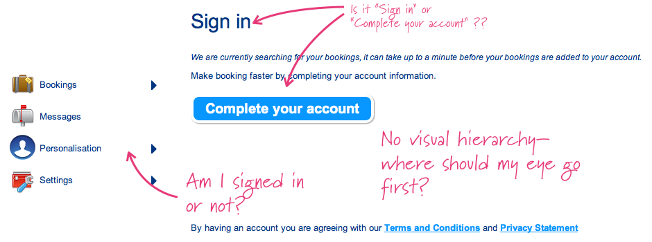
At first glance, this page doesn’t seem all that bad. There are some nice icons, a header, and a big call to action button. But wait…
Why am I here? What is expected of me? Am I here to sign in, or complete my account? And if I’m not signed in, why do I have the option to change settings or view my bookings? And what about that first line, “We are currently searching for…”
Sign In Screenshot marked up
As it turns out, the “Complete your account” button takes the user to a “sign in” page with the familiar username/password combo. Given this was the case, that sidebar information is pretty irrelevant (why show me what I can’t access?!). And that “We are currently searching for bookings…” line is just a distraction—kind of like the person talking at you while you’re trying to fill out a paper form. You can imagine the conversational trainwreck this page would be! There’s a lot of shouting going on, and no clear question being asked.
So how should we redesign this page to address these issues? Well, a simple login screen, with a welcoming message (since this is the first time for someone to visit this page) would probably suffice.
Designing for Micromoments
I’m rather fond of the dating analogy—a good experience is a seductive one. Think of the conversation that happens between two people on a first date. Think of how carefully words are chosen, or how a good conversation is about more than the words. Timing and phrasing are critical—one slip of the tongue or an awkward moment and everything can unravel!
What if we applied this same level of care to the interactions we script when we design a screen? How much better might the resulting digital experience be?
In the same way that we already design for activities, tasks, screens, and states, I’d like to propose a finer level of granularity for our designs: micromoments. A micromoment is the word I use to describe each discrete moment in the interaction when a person might pause, advance, or stop—whether filling out an online form or engaged in conversation. Bill Scott talks about the 96 “interesting moments” associated with a simple drag-and-drop feature. Joshua Porter has written about using microcopy to make confusing forms much clearer. Alan Cooper wrote many years ago about polite software.
Selection-dependent inputs, inline contextual actions, primary and secondary navigation, and other kinds of progressive disclosure (or prioritization)… these are all fairly common practices now. Numerous studies have shown how a simple button label change can make a huge difference to click through and conversation rates. Nothing I’m describing here is novel or new—so, why is this still a struggle for many of the designs we encounter?
Magicians must attend to every detail, or else the illusion they work to create will fail. In a similar way, filmmakers, lawyers, politicians, and other professions attend to every detail, lest their efforts fall apart. How can we ground our work as designers in a way that we don’t lose sight of the critical, nuanced details? For me, thinking of interactions as conversations has proven to be a great metaphor.
Interaction design is a conversation between a human (you!) and the system. This is true whether you are conversing with an online catalogue, or with other people via technology. Why not treat our interactions as proper conversations? Rehearse them the way you would rehearse a theatrical production—get up out of your seat, get others out of their seats, and step through every little detail. You’ll be surprised by what you discover.
And that is my Christmas gift to you—the single best exercise I know of for crafting a better user experience.
Enjoy!

Stephen P. AndersonAbout the Author

Stephen is the man behind Mental Notes card deck—a tool that’s widely used by product teams to apply psychology to interaction design. He also authored Seductive Interaction Design, which answers the question: “How do we get people to fall in love with our applications?’
When he’s not directing experience design at an education startup, he’s consulting and leading workshops to help organizations manage creative teams, create interactive visualizations, and design better customer experiences.

Share Your Thoughts with Us

What micro-moments have your experiences that added to — or diminished — your experience with a design? Lets us know on our blog.